Real-time AI inference
Process breakdown: building Avantra's brand for real-time AI.
Client
Year
Involvement
Brand Strategy,
Brand Identity,
Illustration System,
Deck & Memo Design,
Website Design
What was the brief?
Where Avantra was
Avantra had investor materials due, a memo and a deck, and no identity to put on them. The brand, the logo and the templates all had to land inside a four-week sprint.
What Avantra does
Avantra is the serving layer for real-time multimodal AI: speech-to-text, the model and text-to-speech co-designed for latency, so a voice agent can answer before the pause feels awkward.
What they asked us for
A brand identity, a logo and wordmark, deck and memo templates, an illustration system, and a component library with a design.md the team could build from.
Why it mattered
Avantra did not want to read as just another AI API you plug a model into. It wanted to look like the high-performance infrastructure layer powering real-time AI.
We started with words, not pictures.
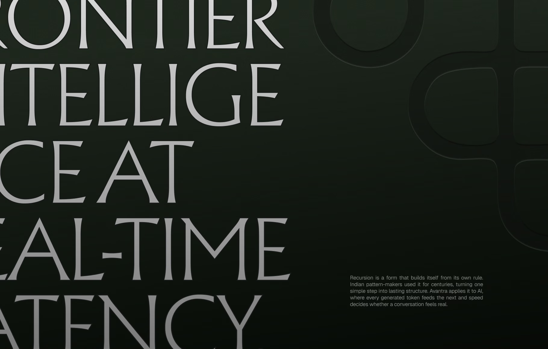
Our brand workshop turned into a page of keywords: frontier intelligence, timeless, engineering-first, latency, gold circuits. The name means a cycle, a form that builds itself from its own rule, and the founders wanted a hint of Indian lineage. Our first rule: lineage as character, never as ornament.
Two moodboards, two bets on the same company.
Before drawing a single logo we wanted to agree on a feeling. The workshop gave us the words; the moodboards turned them into two distinct bets on how Avantra should come across in the room with an investor or an engineering lead.
Both started from the same constraints. Lineage as character, never as ornament. Indian, not Greek, structure. Premium without the usual AI gradient. And a brand that could carry the weight of a technical claim like frontier intelligence at real-time latency.
Where they differed was in how loud the heritage got and what material carried it: sculpted gold or earthy terracotta. We presented them side by side so the founders could react to a direction, not a detail.
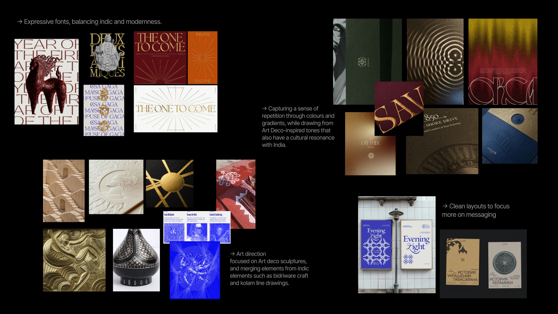
Moodboard 1: Art Deco sculpture meets Indic craft.
Expressive type balancing Indic and modern, clean layouts that let the message lead, and art direction drawn from Art Deco sculpture, bidriware and kolam line drawings. Repetition carried through colour and gradient, in tones that sit between Art Deco and India.
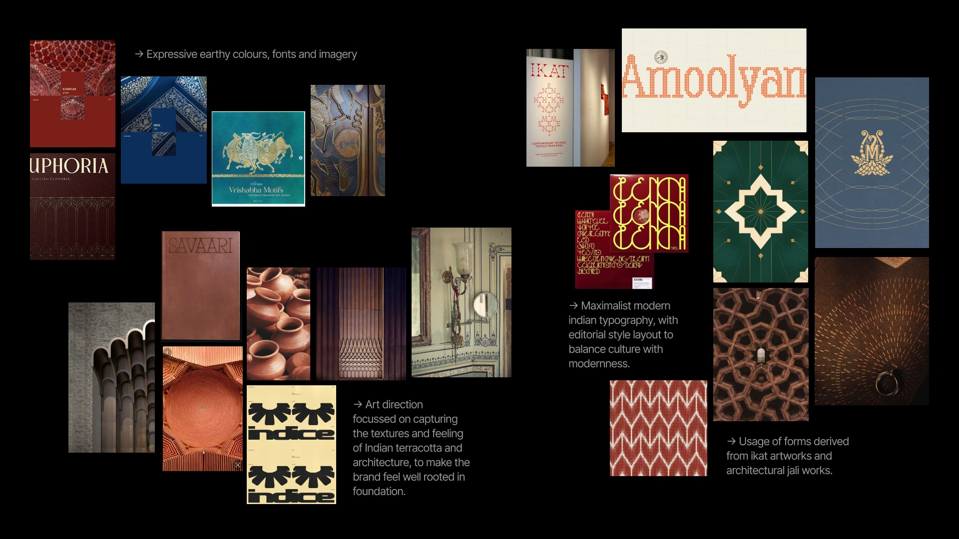
Moodboard 2: terracotta, jali and ikat.
An earthier route: the textures of Indian terracotta and architecture, maximalist modern Indian typography in editorial layouts, and forms taken from ikat weaves and architectural jali. The aim was a specialist inference company with roots, not another Indian startup.
Iteration 1: two directions, one deck.
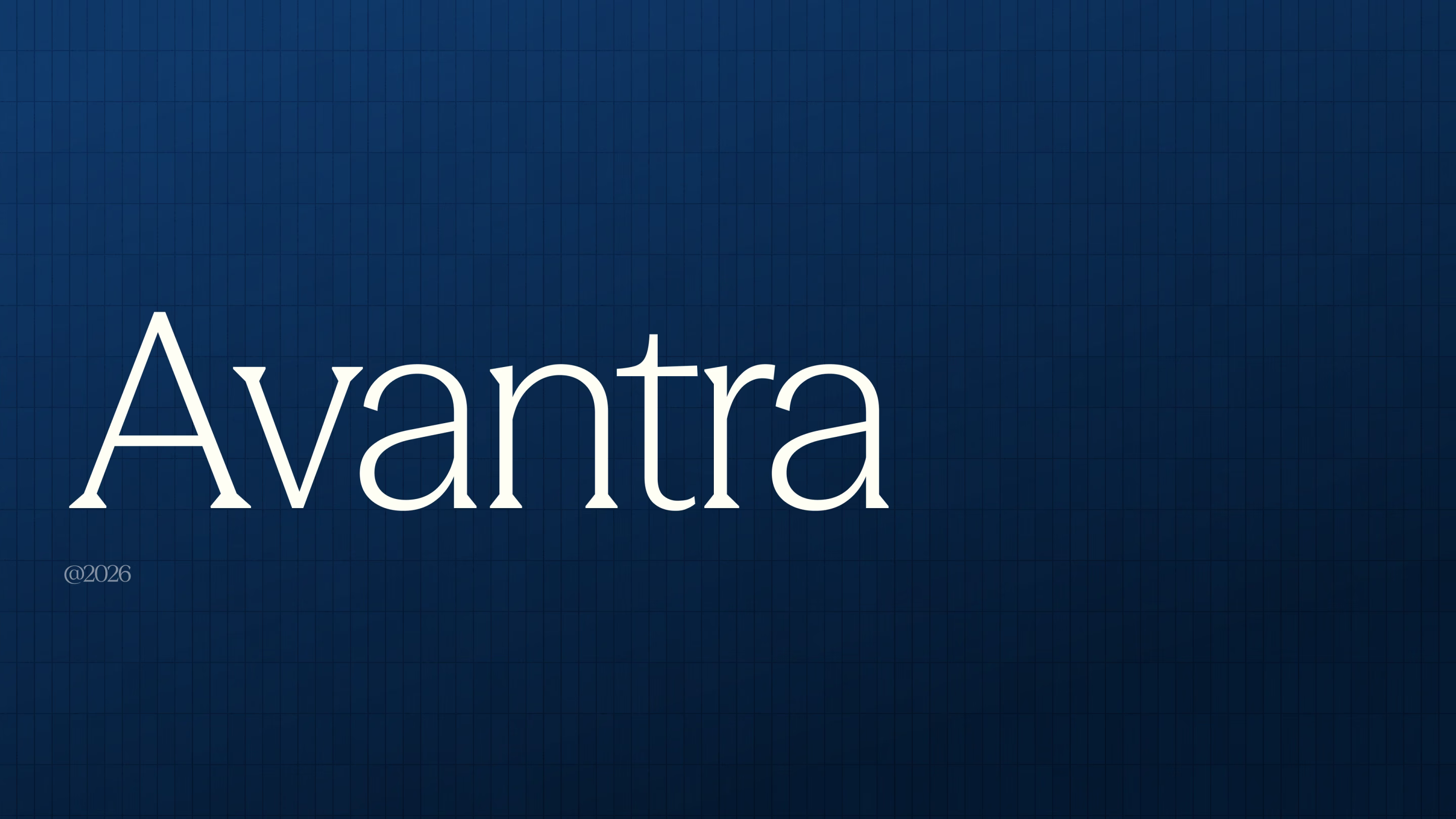
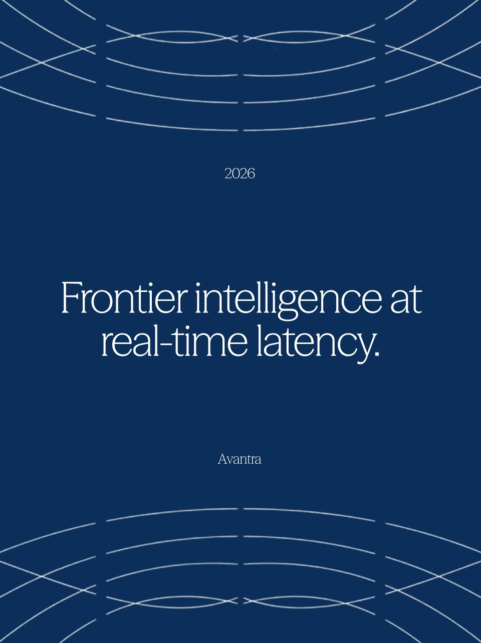
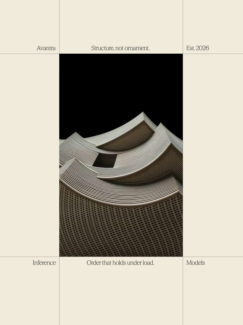
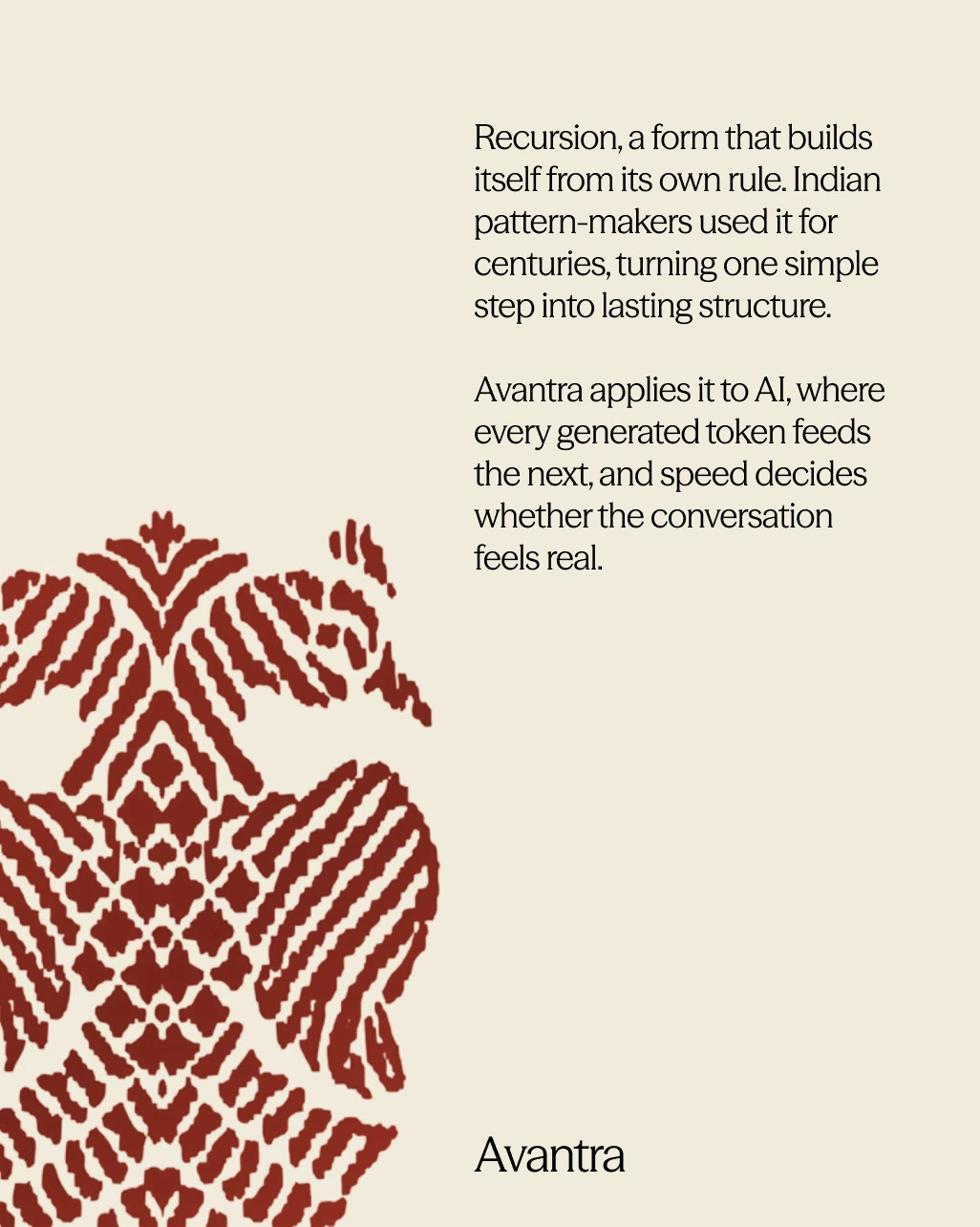
A moodboard is easy to like and hard to judge. So for the first review we took both directions onto the same deck content: the title slide, the line, the recursion story, a poster and a wordmark lockup. The founders could compare Avantra against Avantra, not mood against mood.
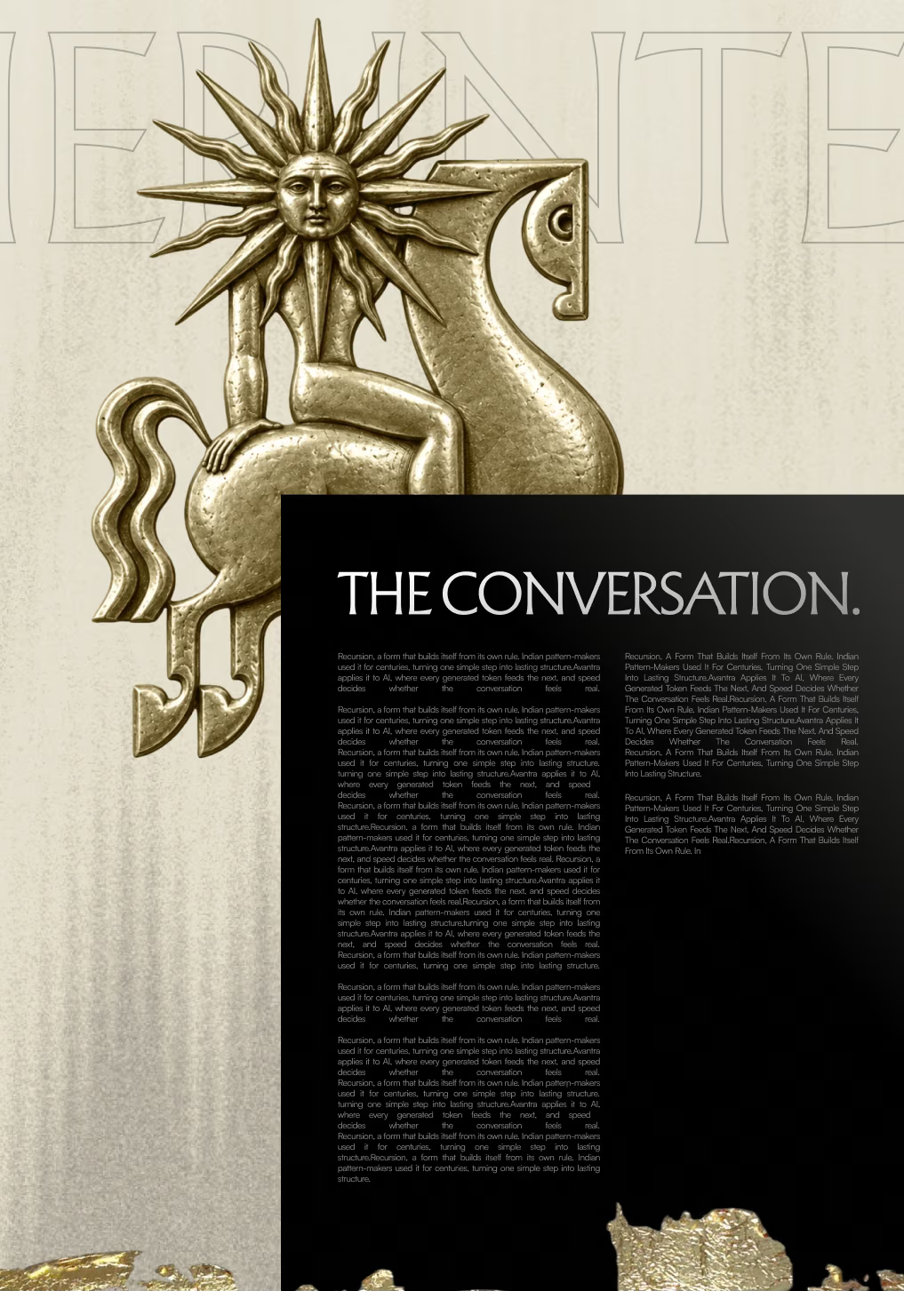
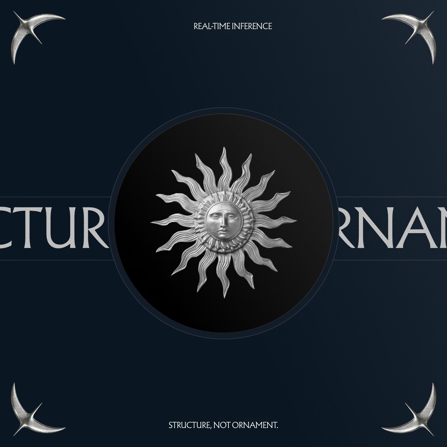
Direction 1 led with gold relief sculpture and an expressive serif and Direction 2 with deep blue, cream and terracotta textures.
The call was quick: Direction 1 was the clear winner. The agreed next step was to extend it into two or three logo concepts and test it on the touchpoints that mattered most, the landing page, the deck and posters.
Direction 1: gold relief and an expressive serif.
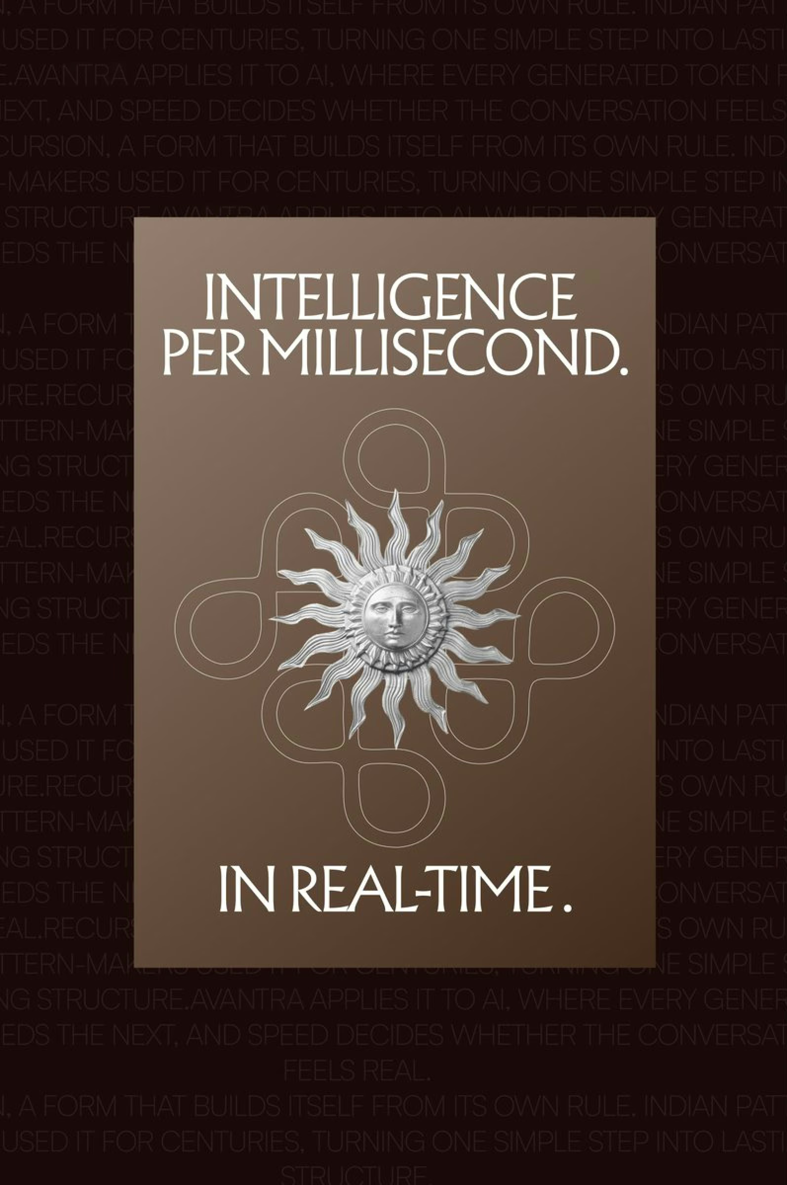
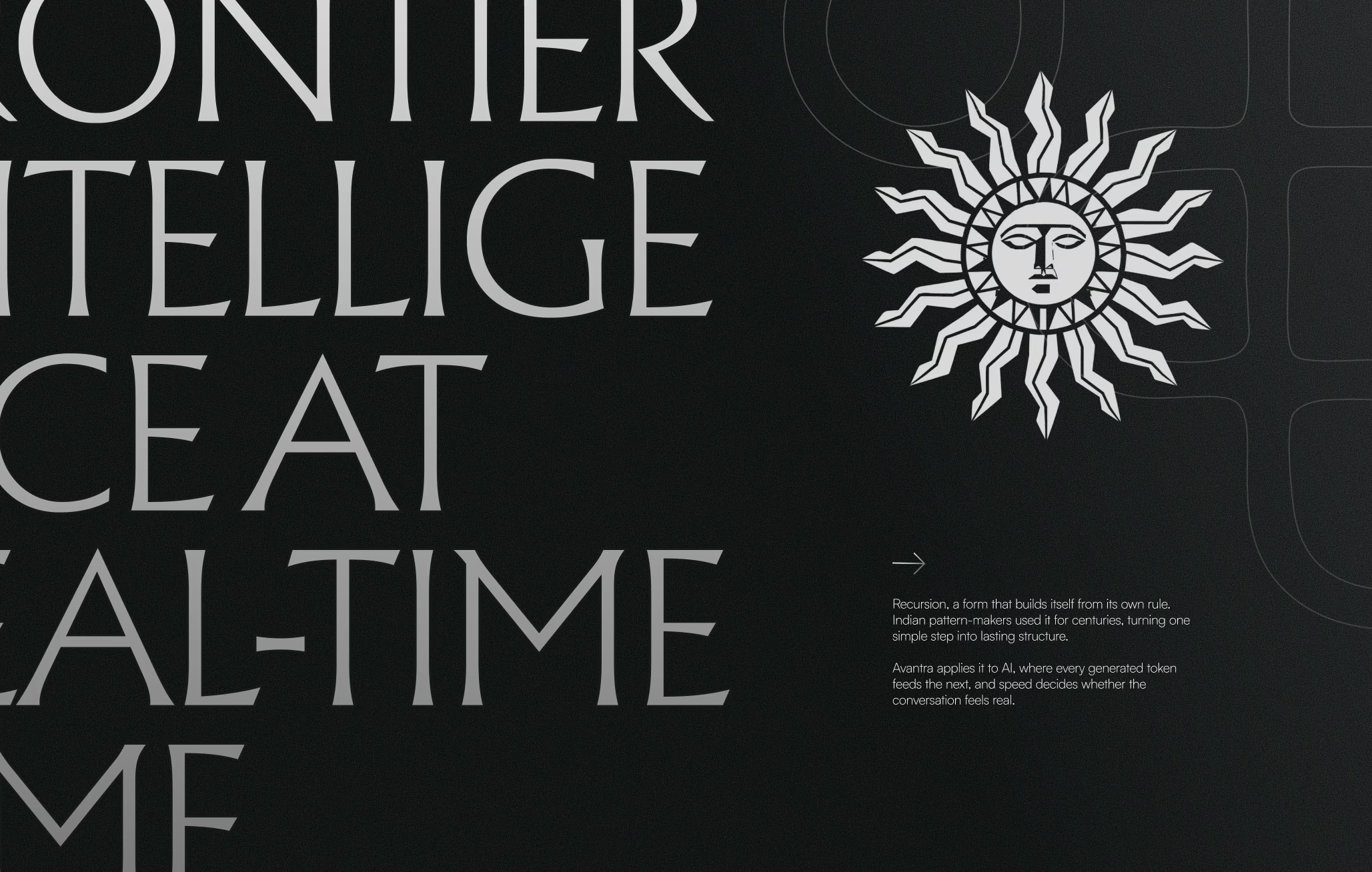
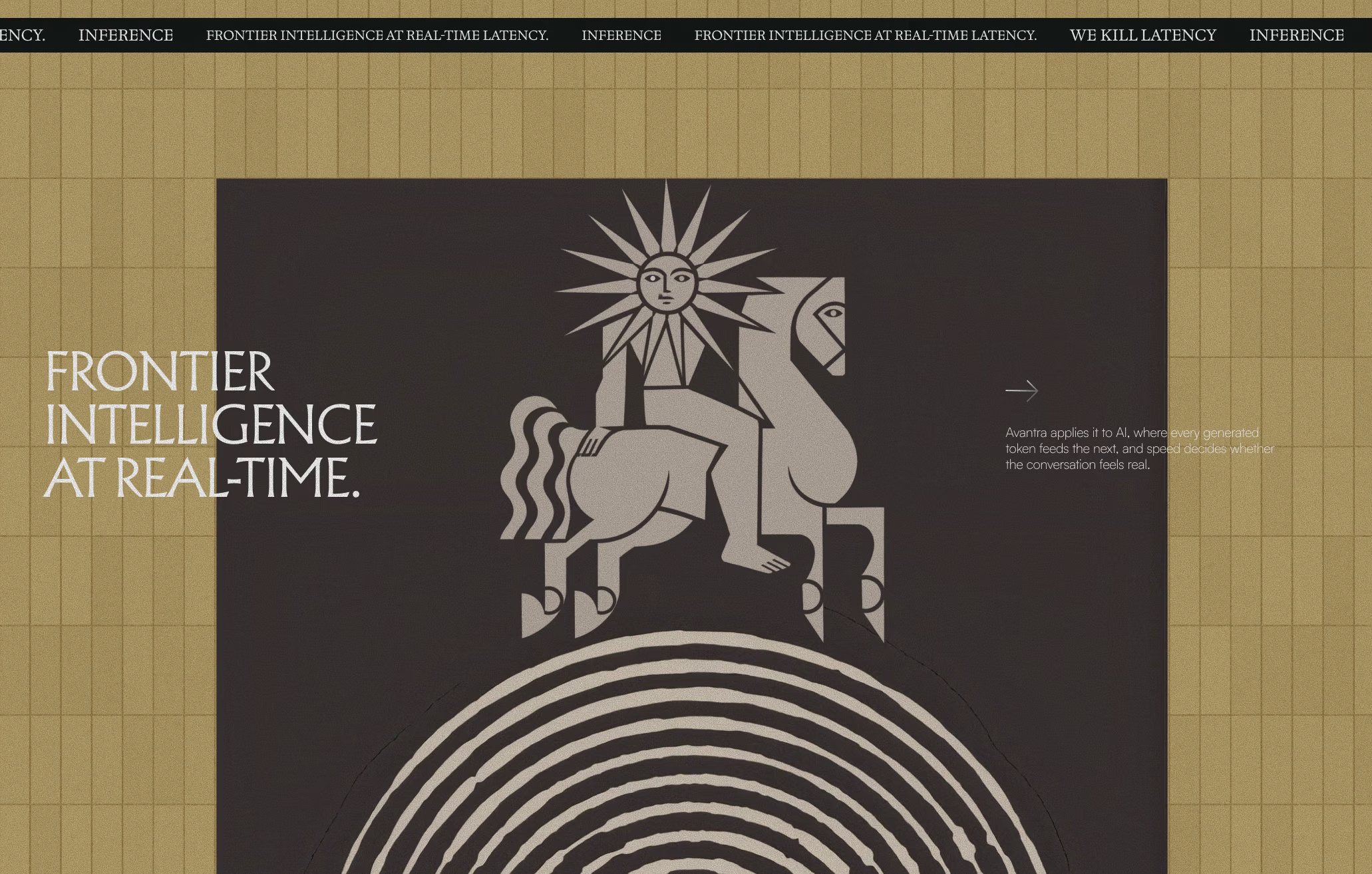
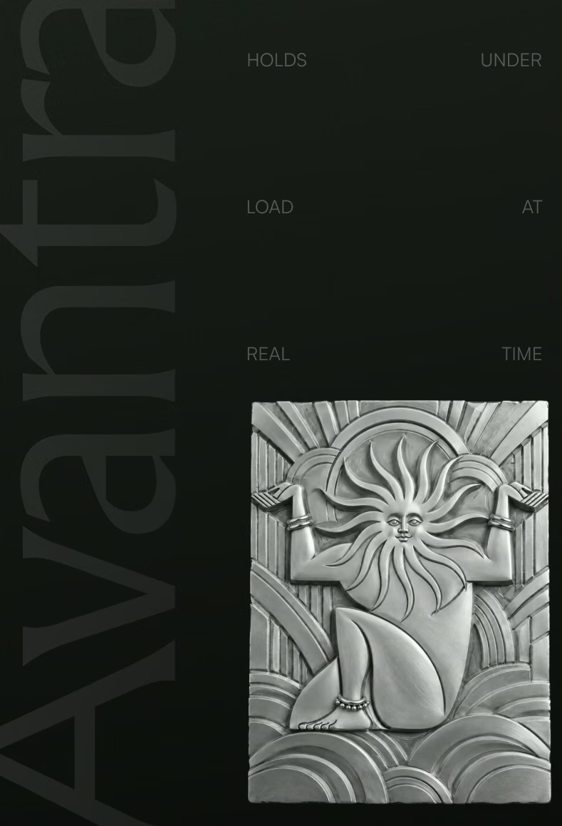
Gold relief panels, a sun and a horse in silver, and type that carries the line on its own.
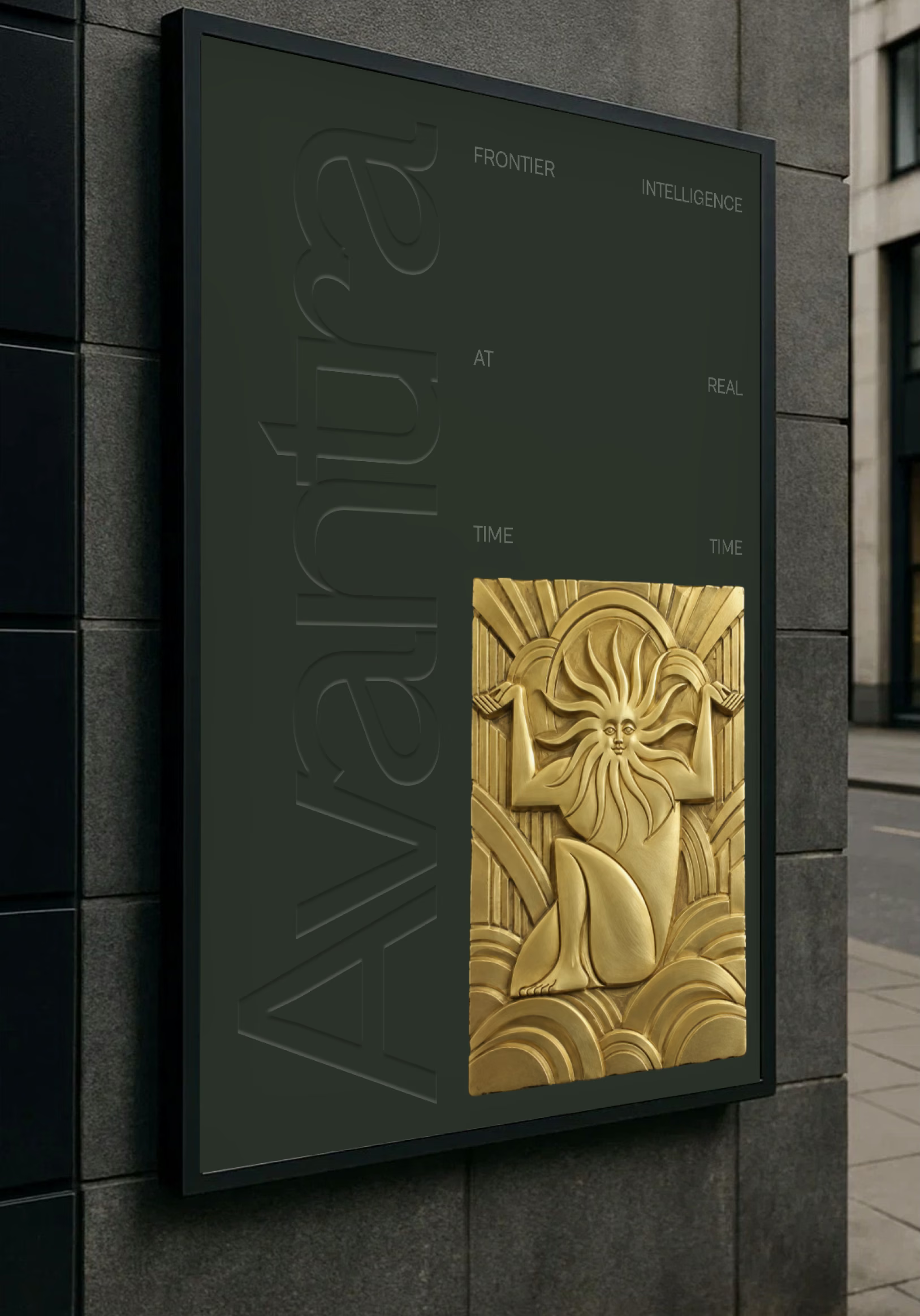
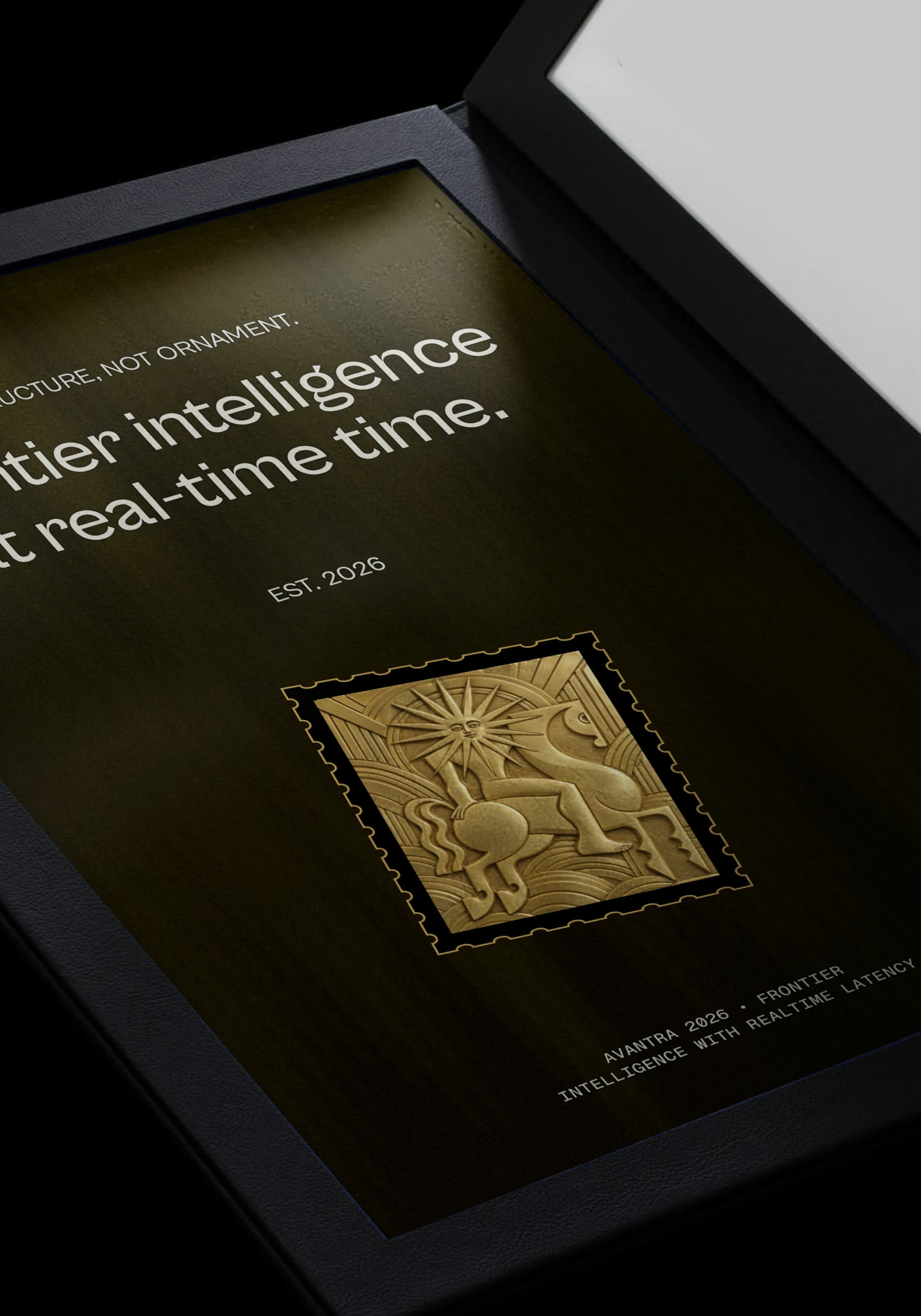
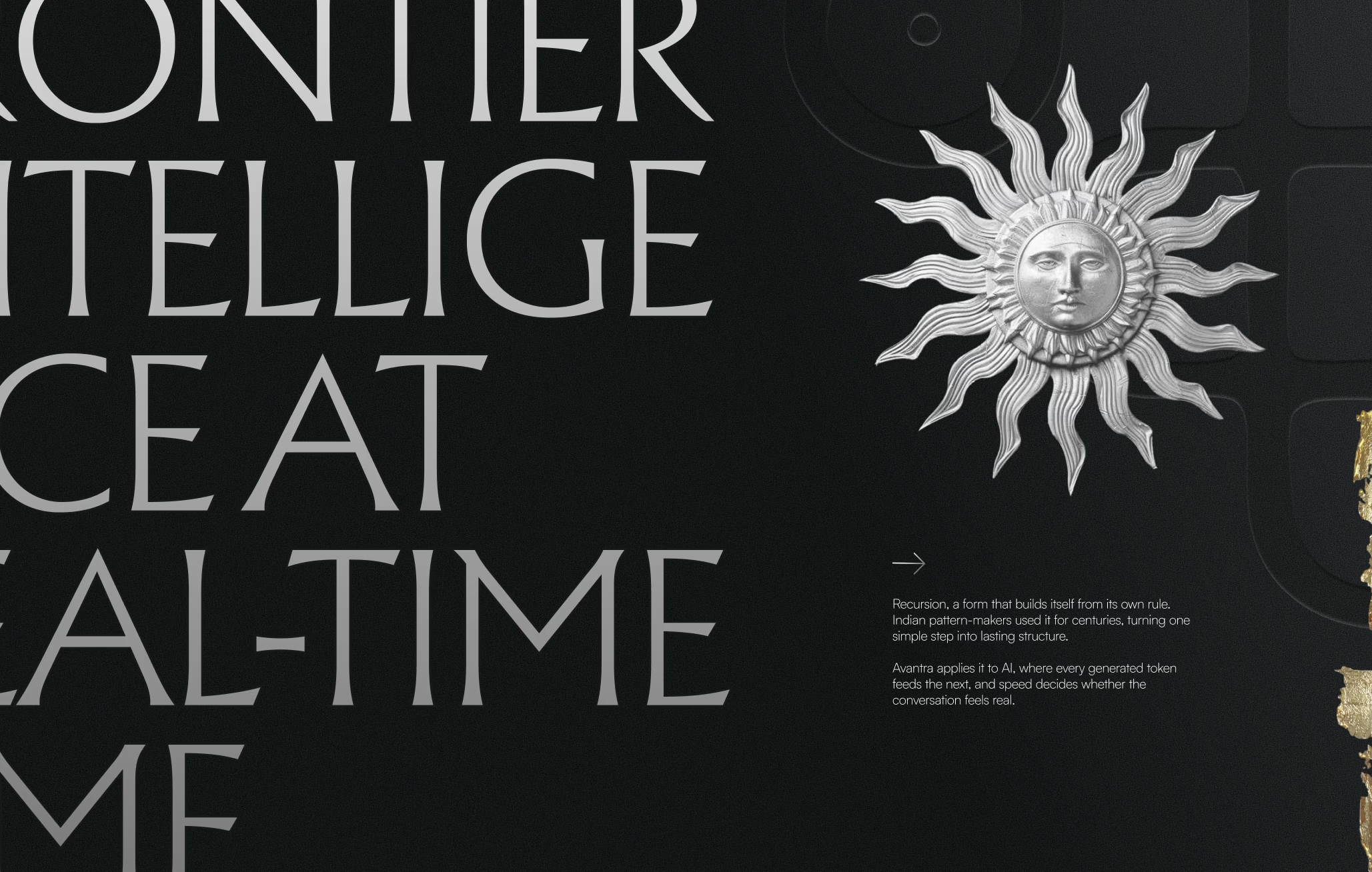
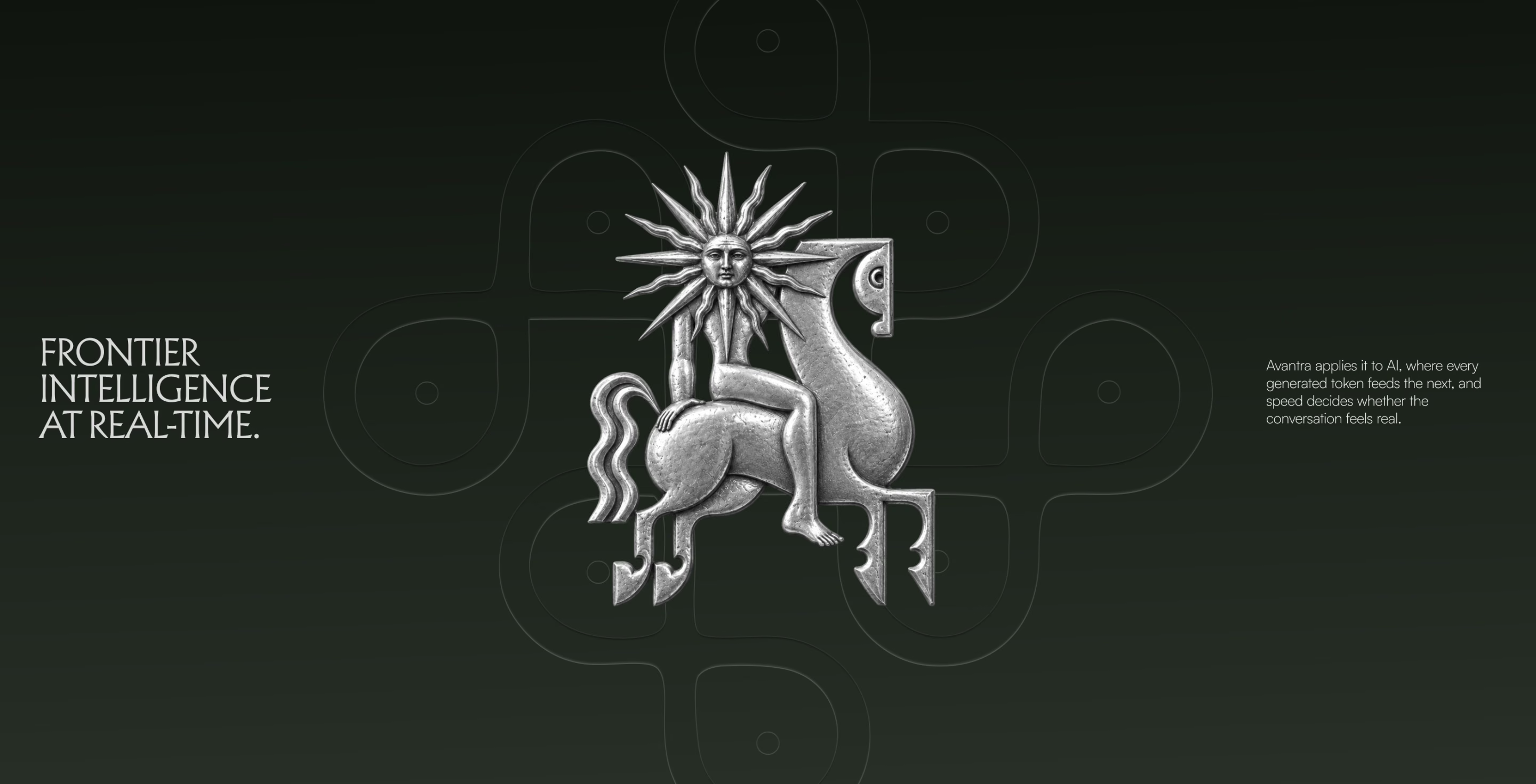
Direction 2: blue, cream and terracotta.
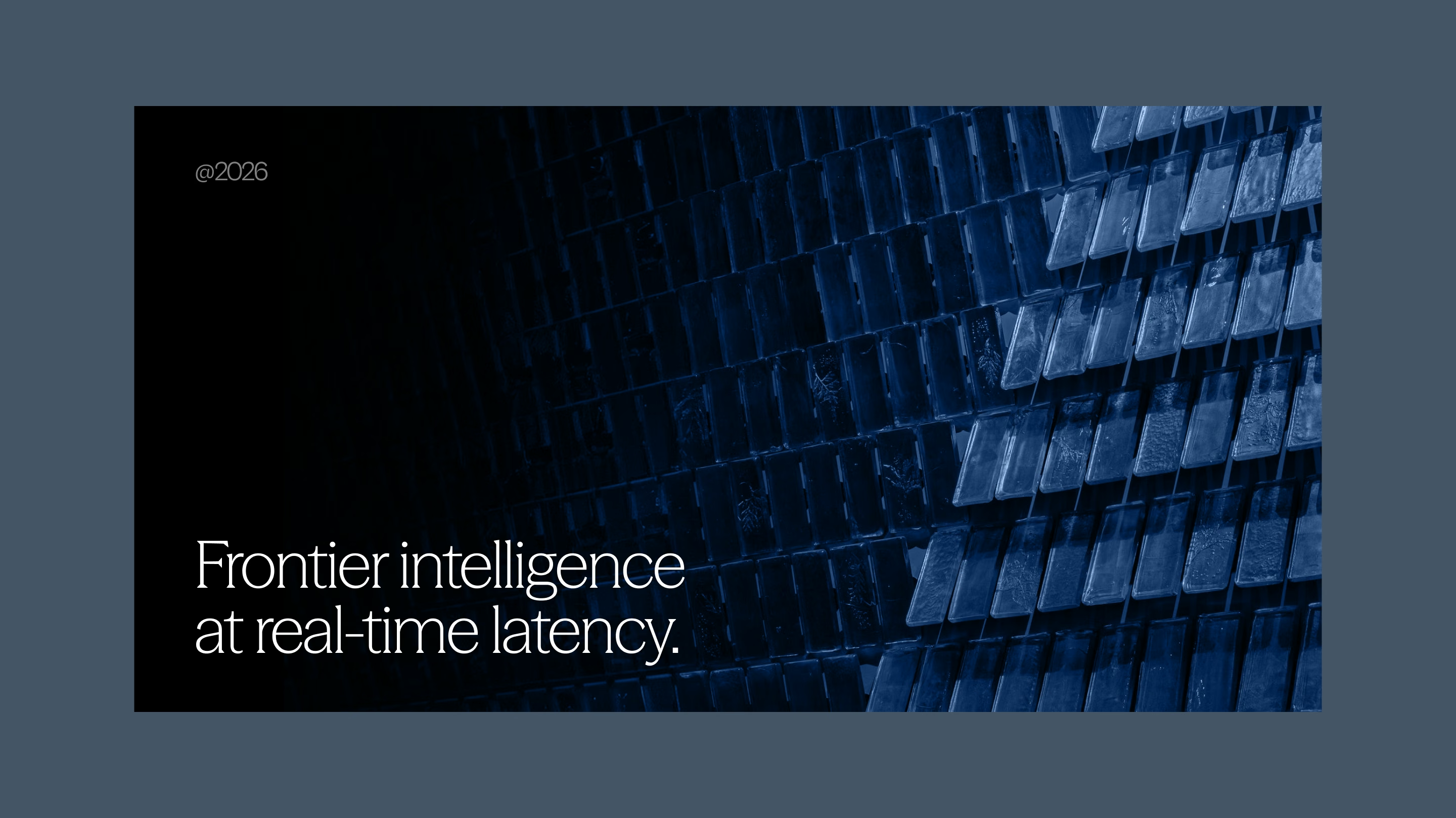
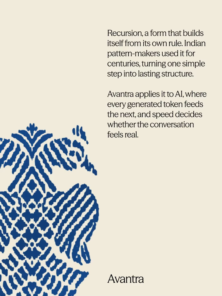
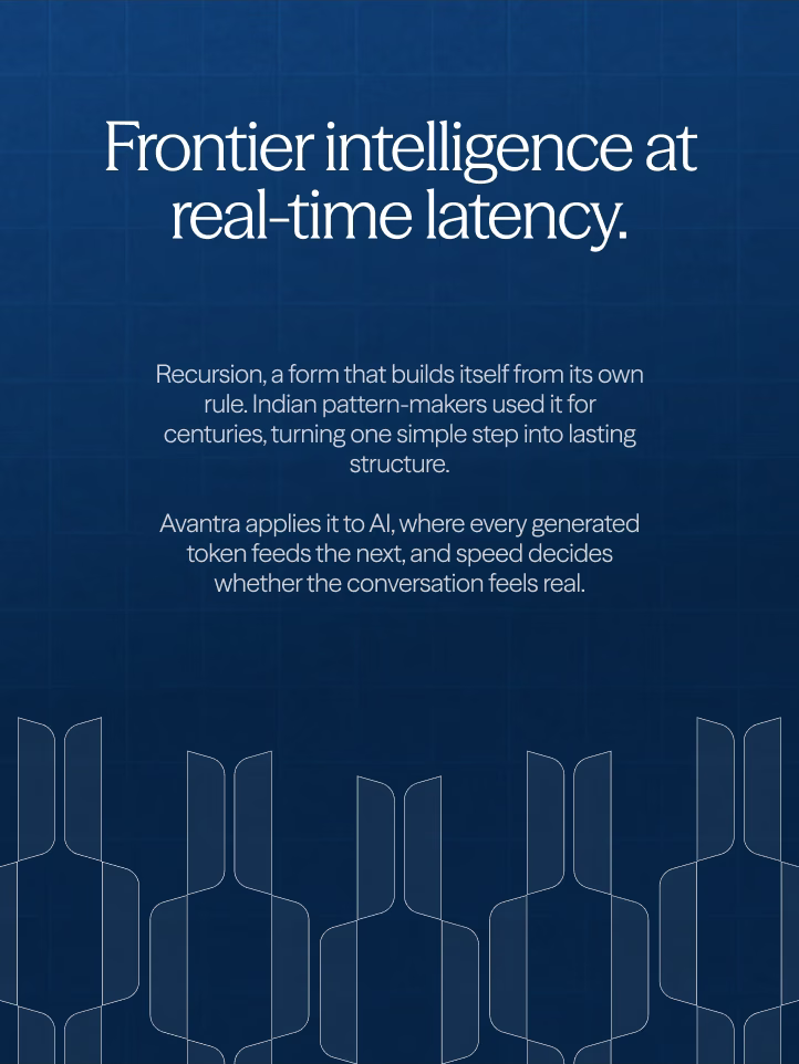
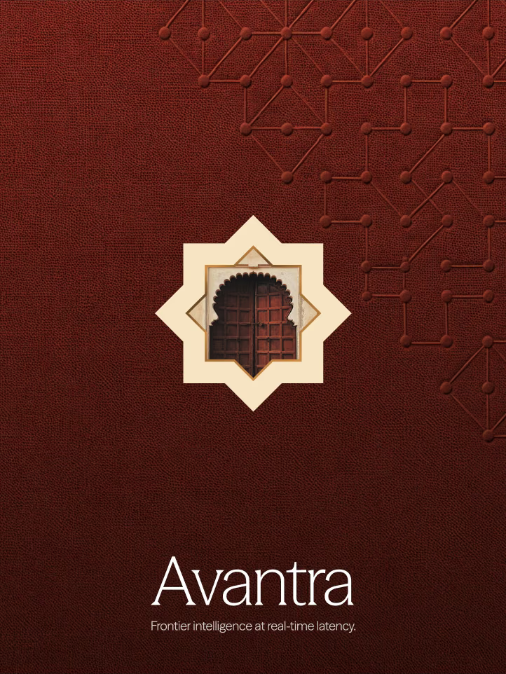
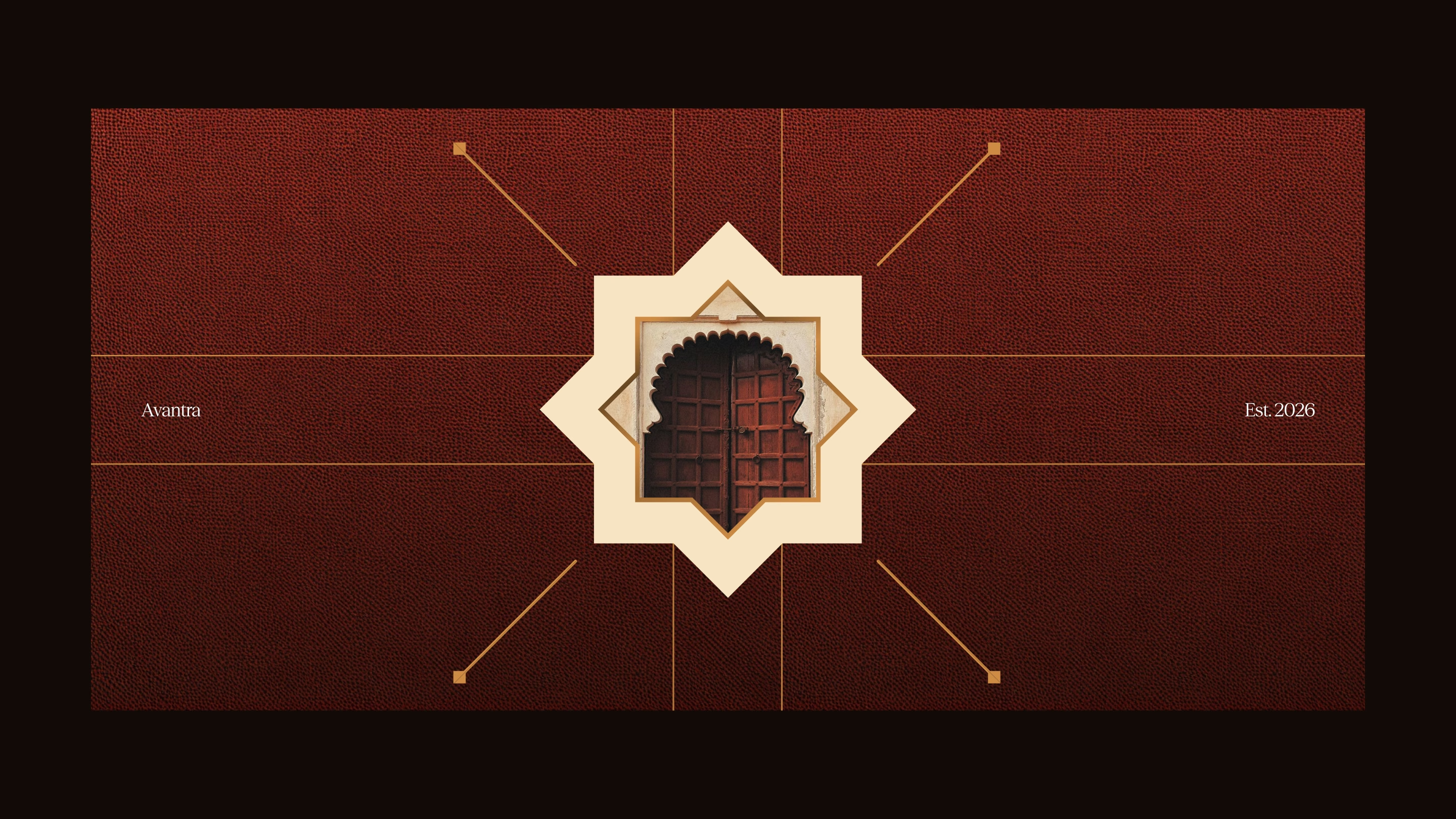
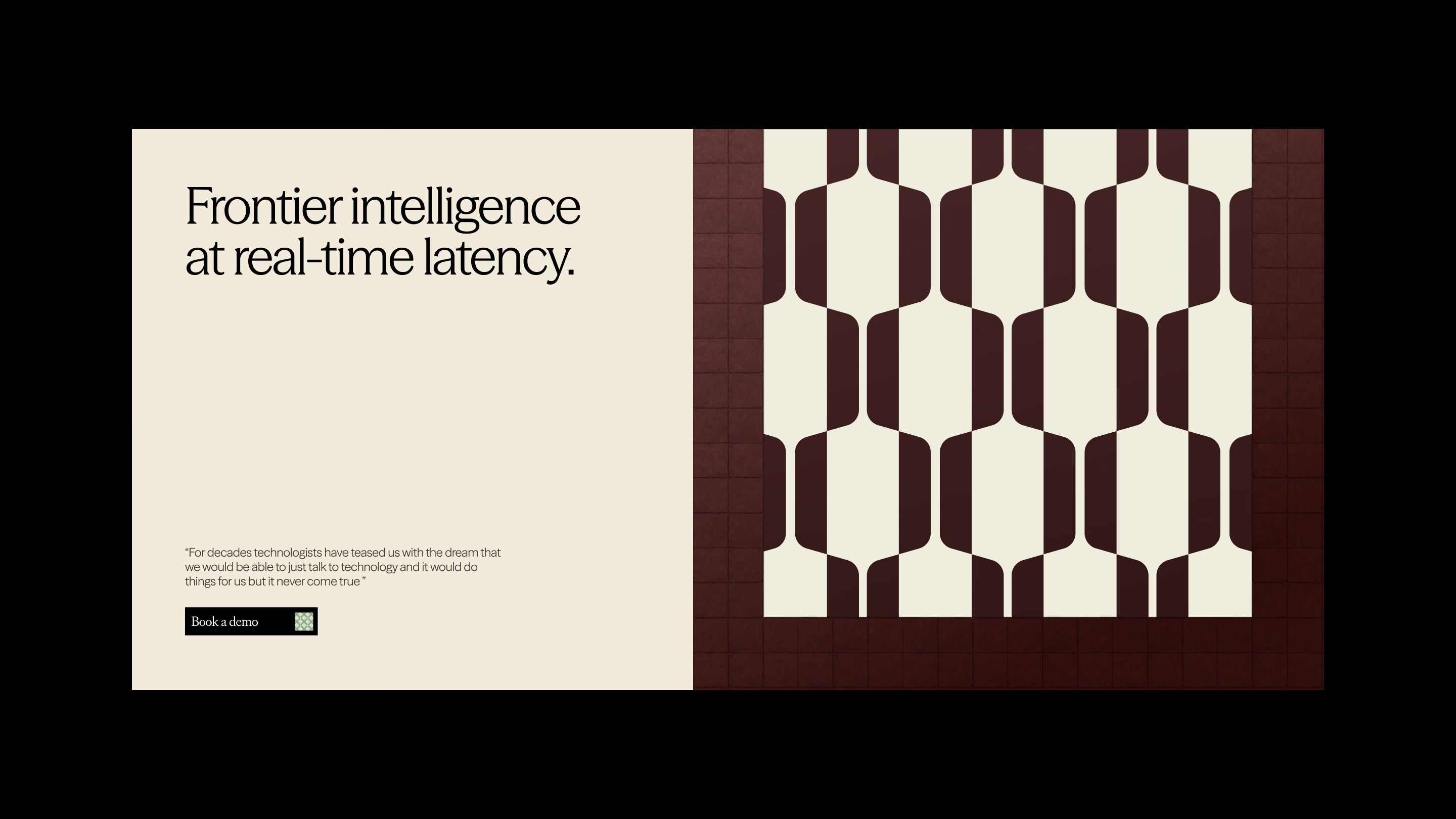
Ikat and jali forms doing the decorating, on a deep blue. The founders later asked to see key slides in this blue too, so Direction 2 went onto the same content as Direction 1 for a direct comparison: a title slide over a blue facade, the recursion story beside a terracotta jali pattern and new posters in blue, cream and rust. The blue stayed in the toolkit and comes back as the dark ground of the final direction.
Iteration 2: Direction 1, pushed further.
Picking a direction is the easy part. A direction only counts once it works on a real deck, a memo and a poster, and Avantra's investor materials were already going out on the new brand.
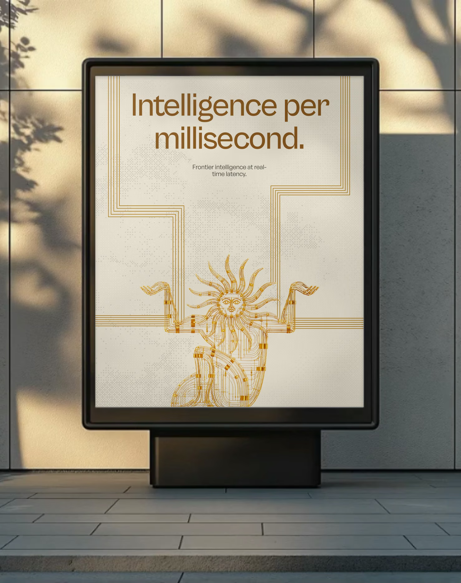
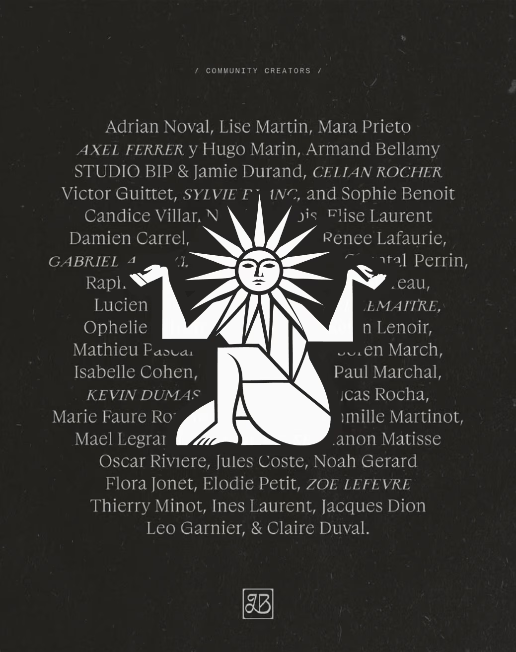
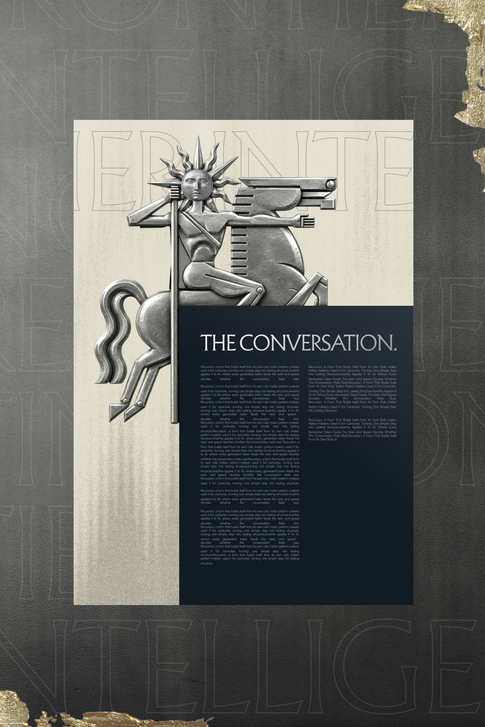
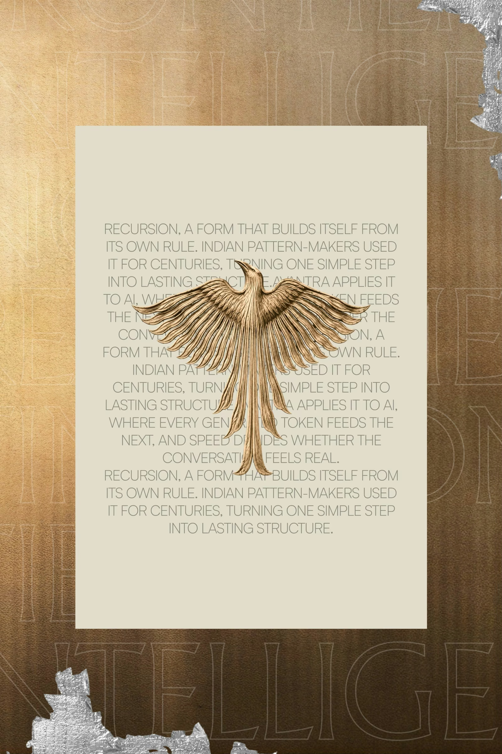
So we took Direction 1 further on the same content. The sun and the horse turned into posters, cards and lockups, the recursion story got its own typographic layouts, and we tried the poster system in navy, green, rust and black.
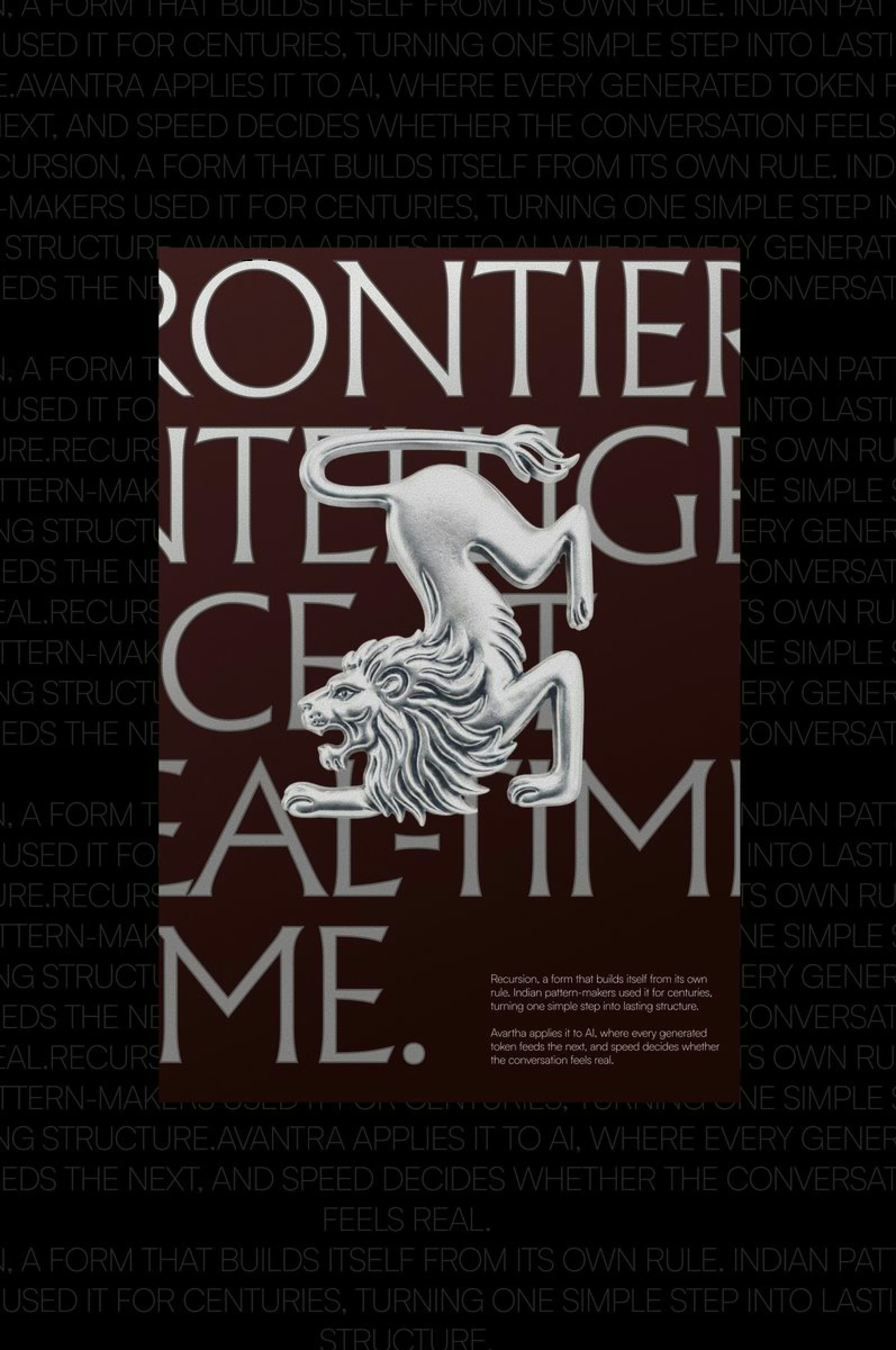
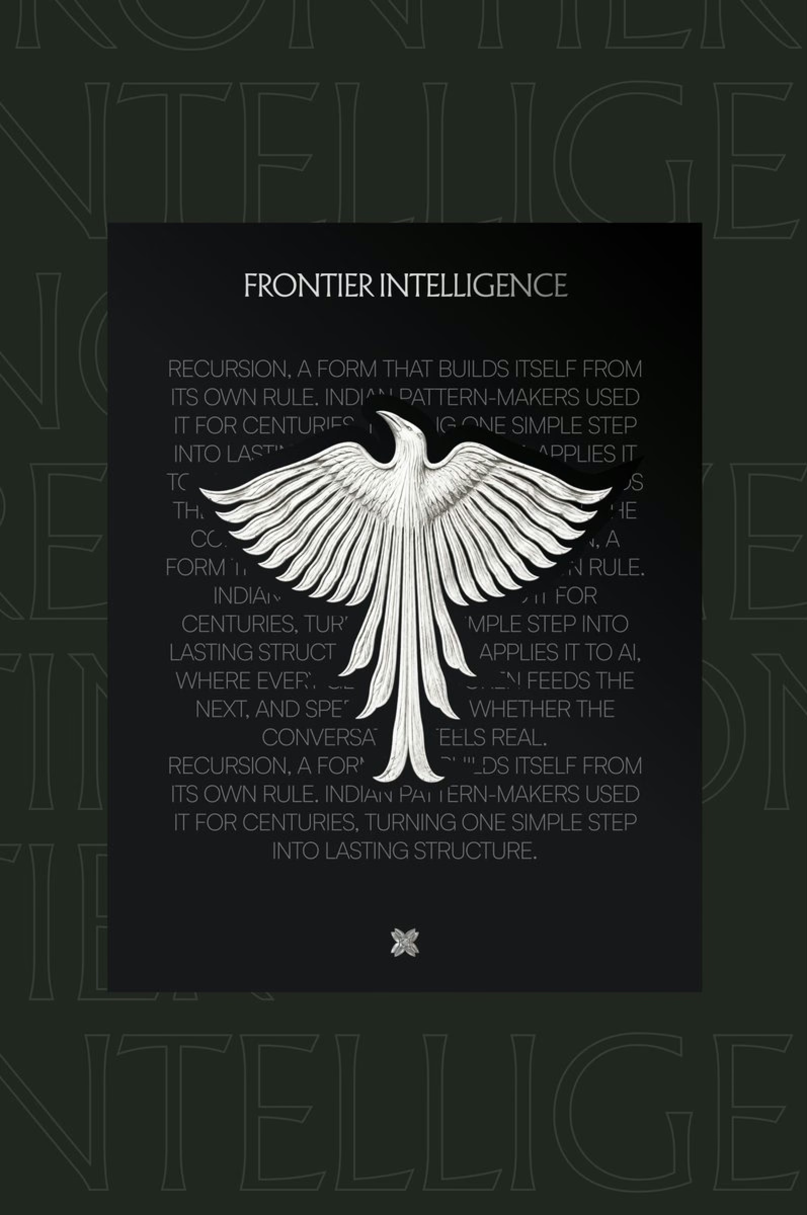
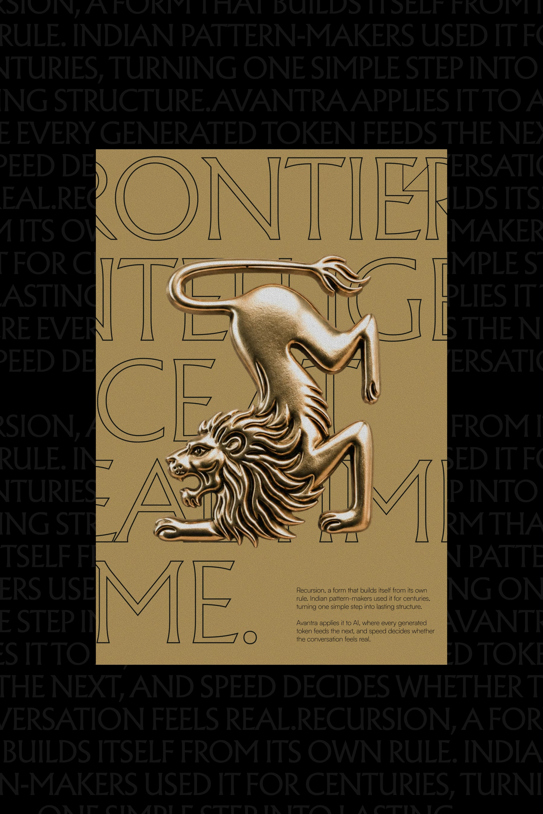
We also tried a character: figures drawn from Indian sculpture and folk tales, led by a lion, an eagle and the sun in silver and gold. They looked good in isolation, but each one needed an explanation to connect it to an inference company.
Sun, horse and the characters.
The lion, the eagle and the sun take turns in the same poster format. Everything else sits on shared content, so each change is easy to compare.
Iteration 3: the heritage at full volume.
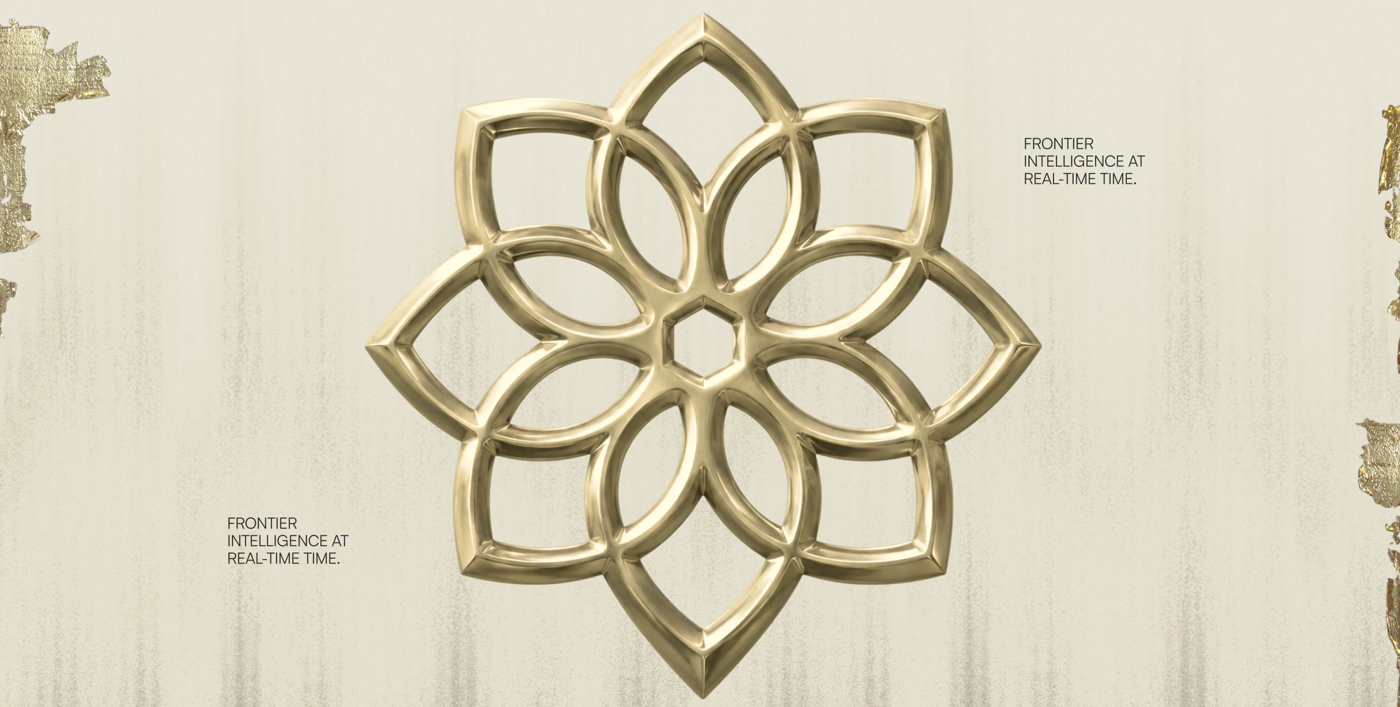
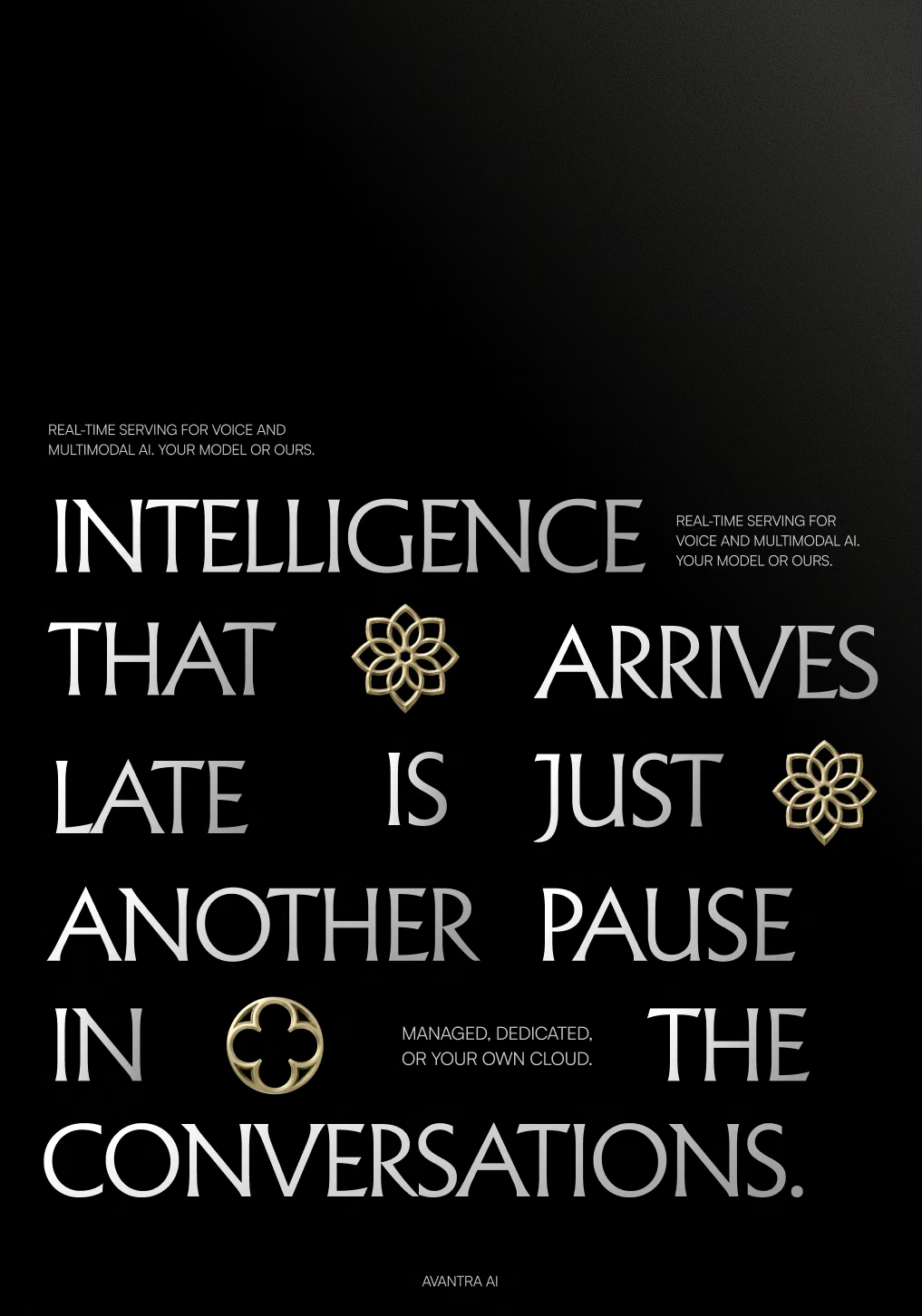
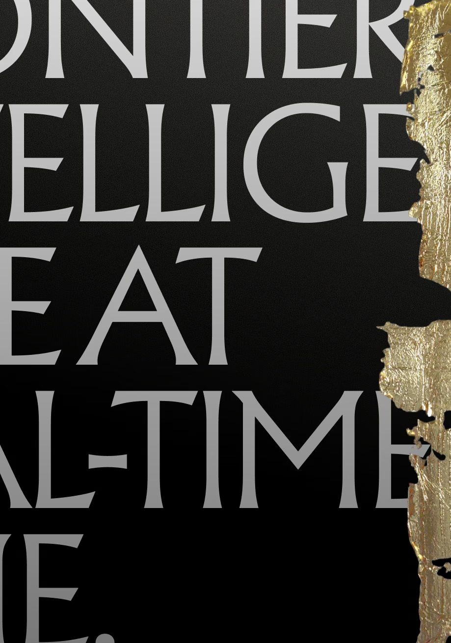
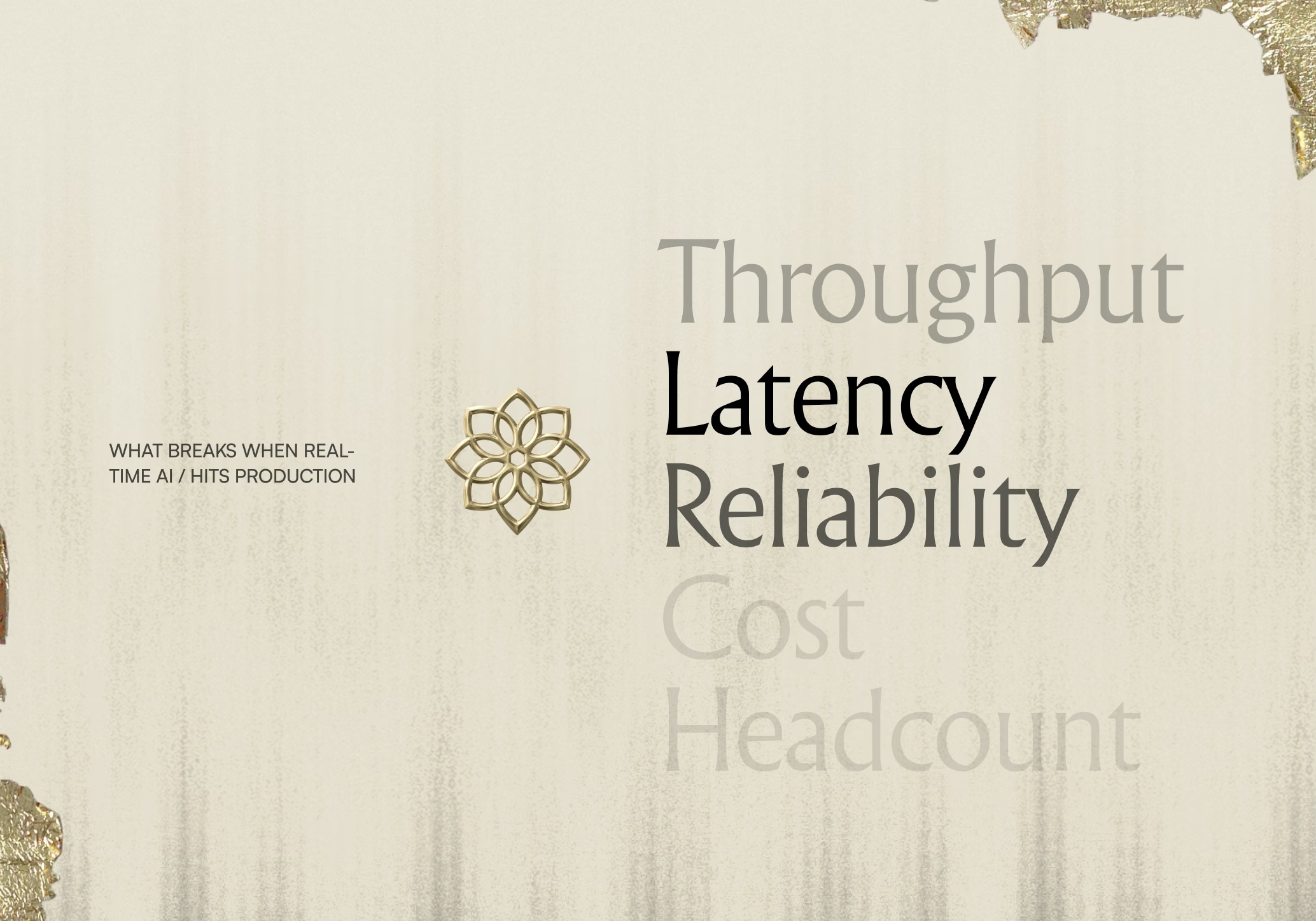
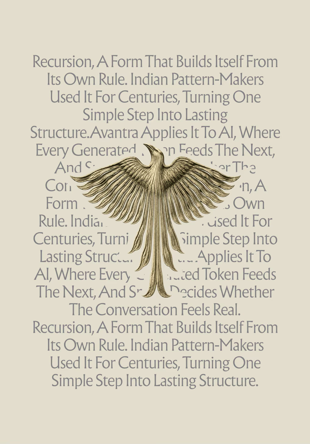
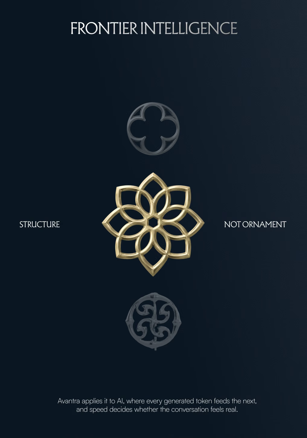
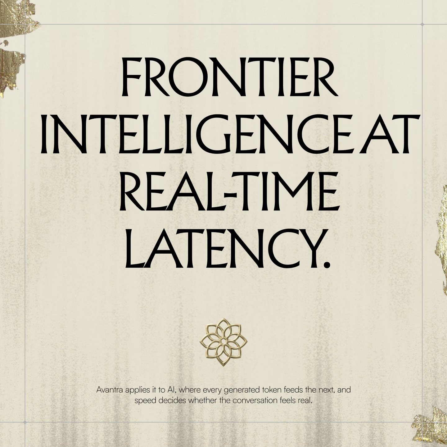
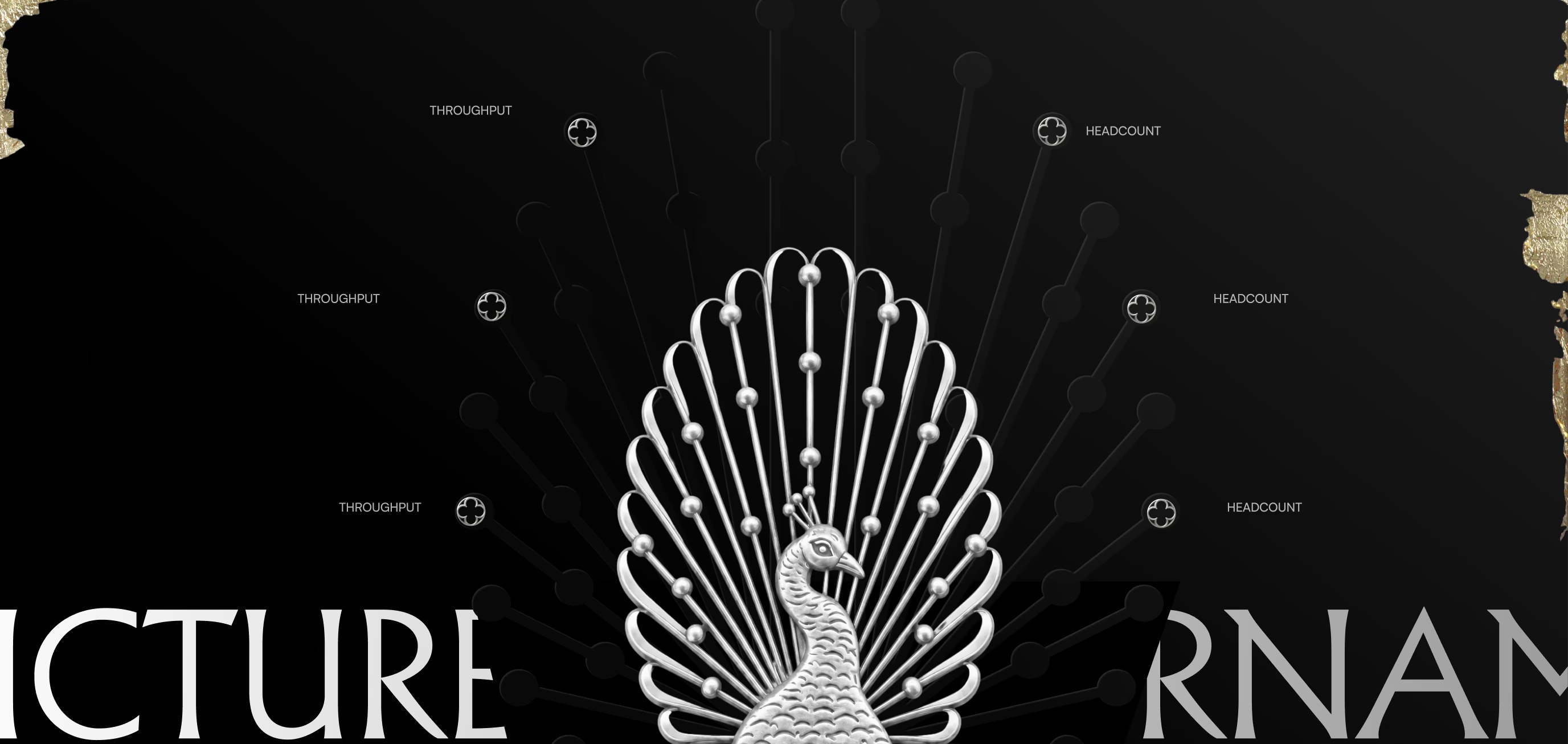
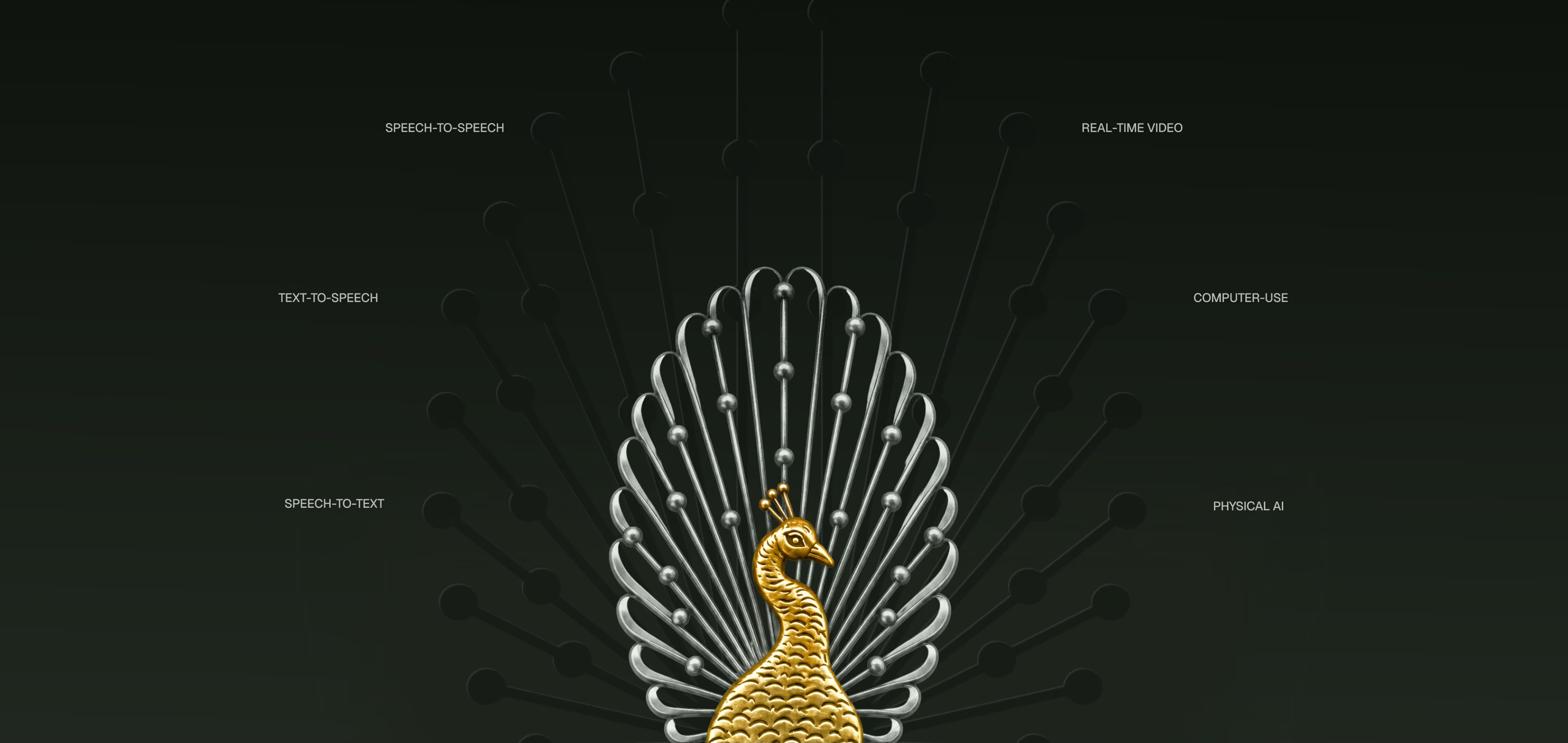
Next we explored how far the heritage could go. Cream and gold leaf, a lotus mark, a peacock and a horse framed Avantra's claims, like 'intelligence that arrives late is just another pause in the conversation', in an ornate, editorial voice.
Seen across a full set of touchpoints, the heritage and decoration had started to dominate. Ornate type, jali patterns and imagery read as historical and elegant, while the technical side had almost nowhere to live.
That was the useful lesson of the round. Avantra sells latency, throughput and reliability, and the brand had to look like it could measure them.
Lotus, peacock and gold leaf.
Slides and posters from the extended explorations, on cream and black.
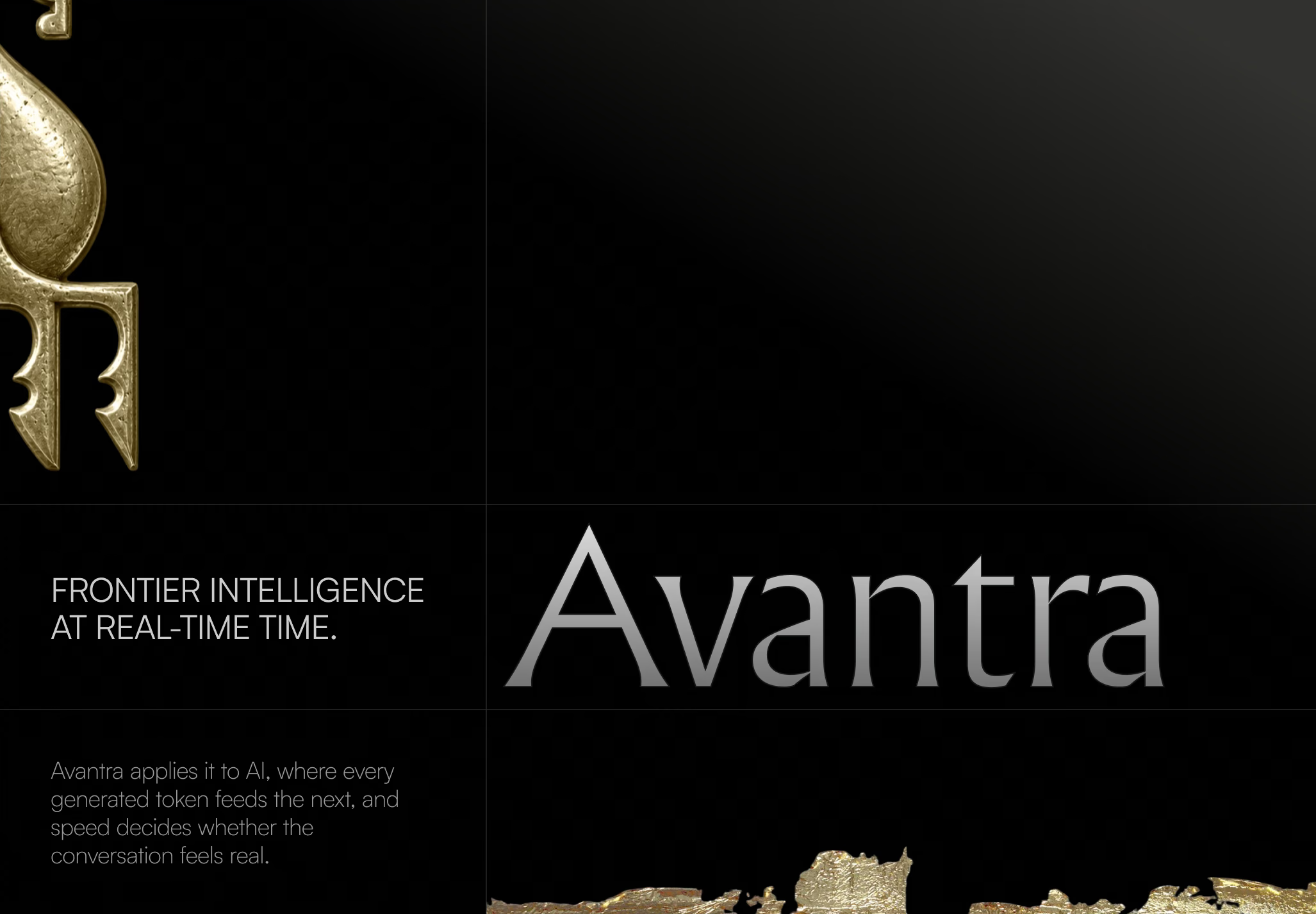
Iteration 4: Art Deco × technical.
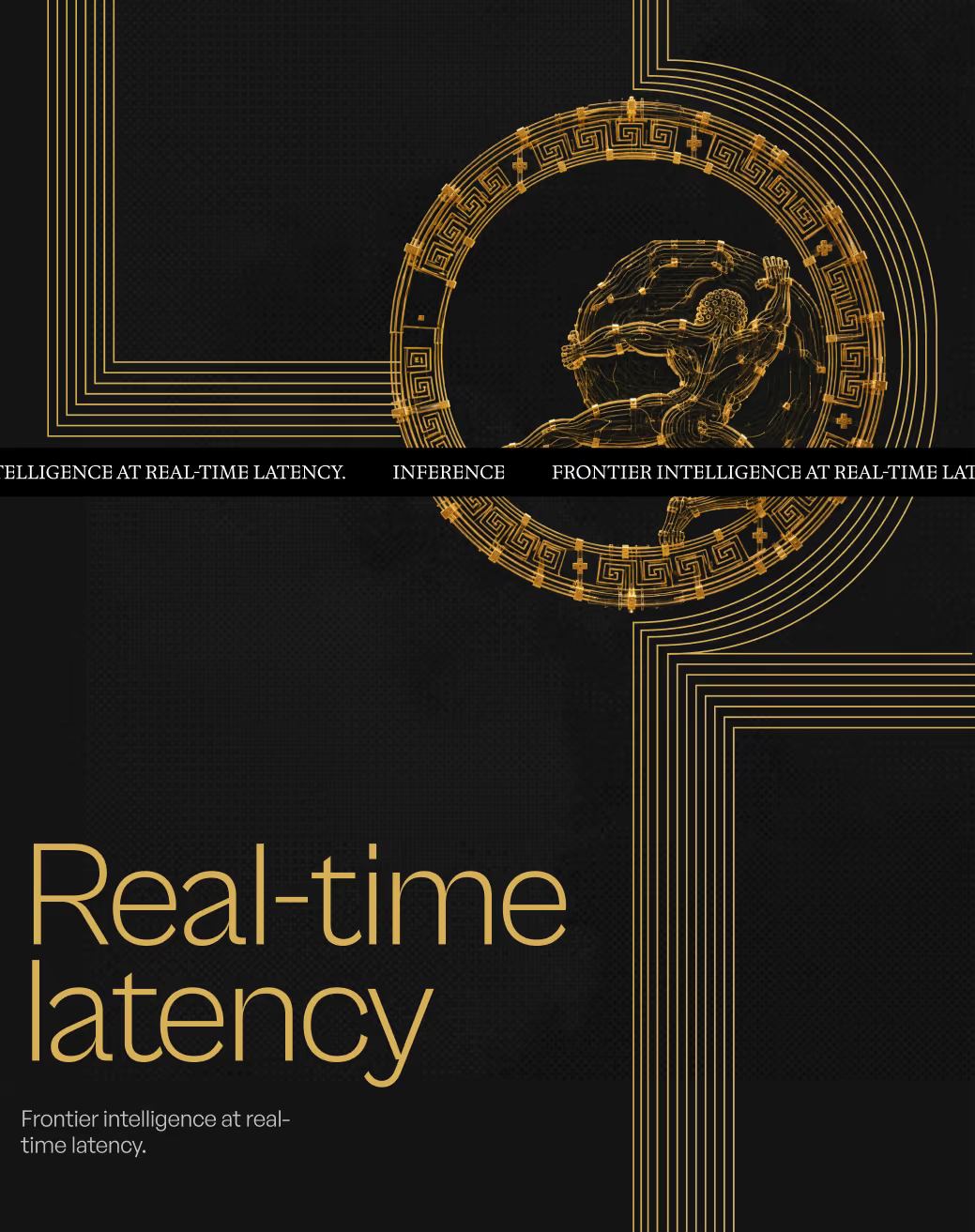
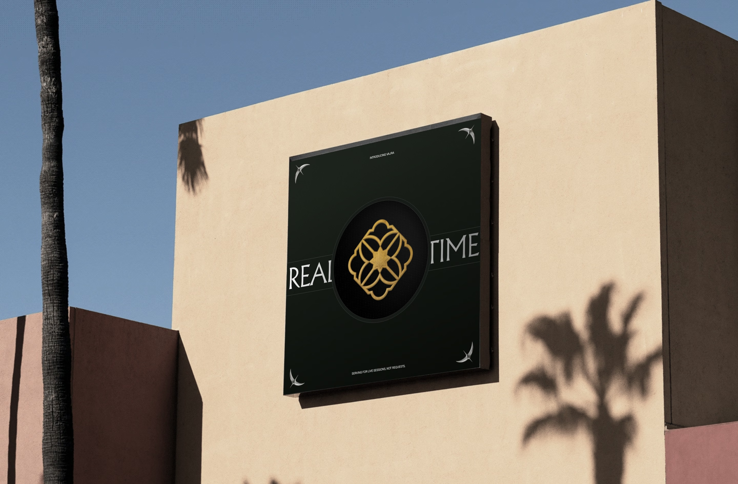
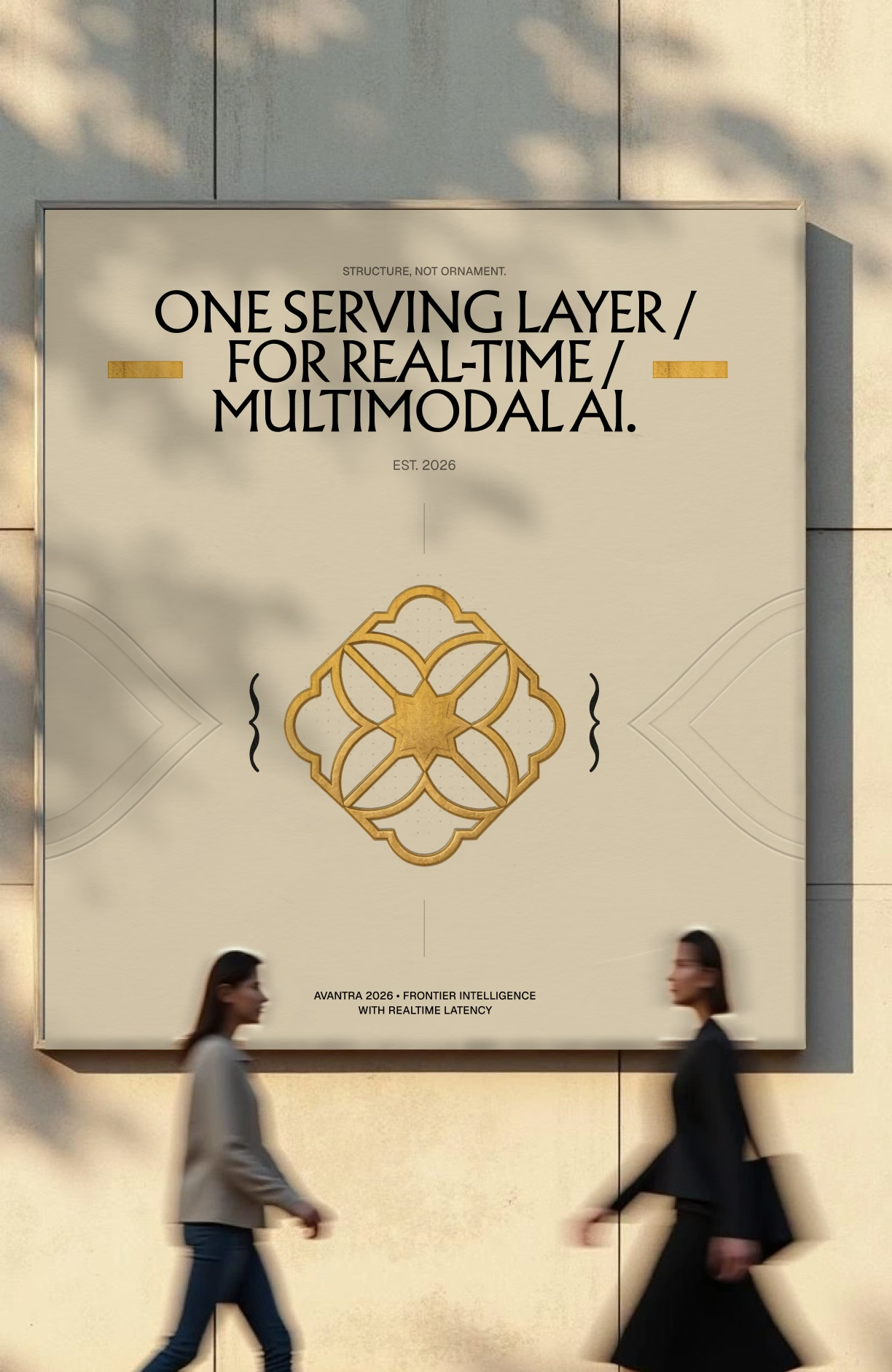
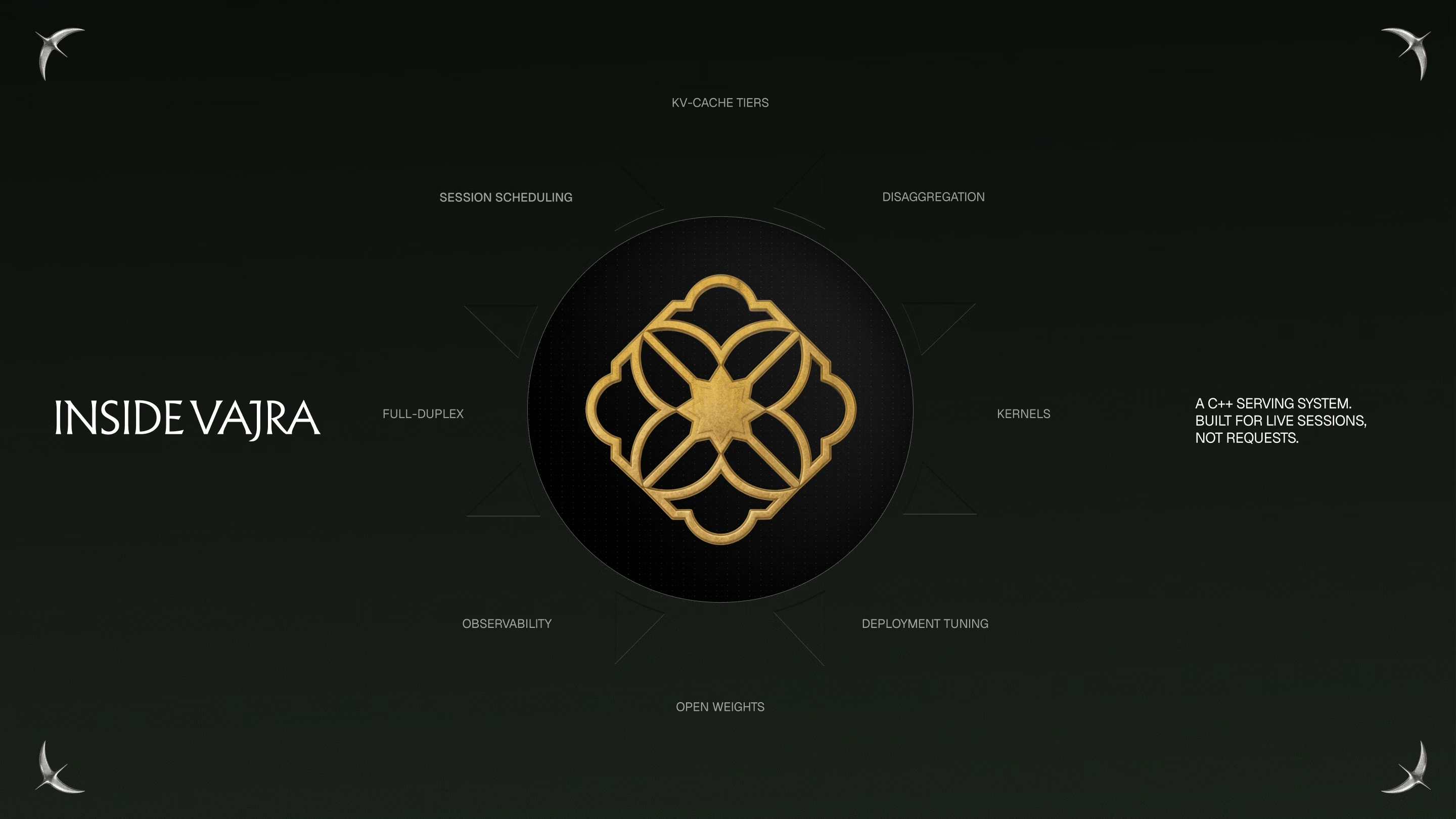
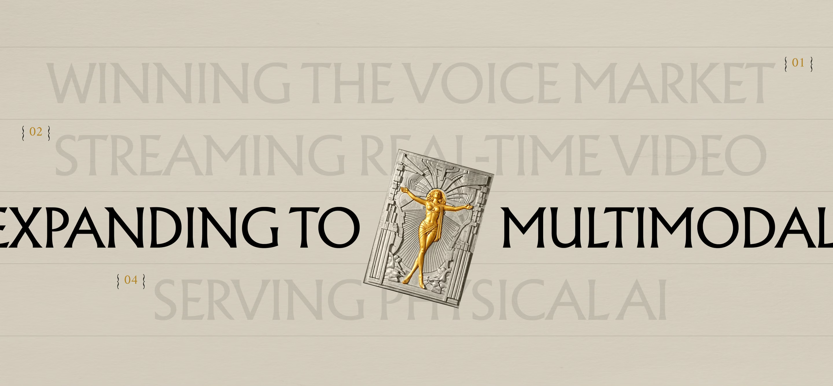
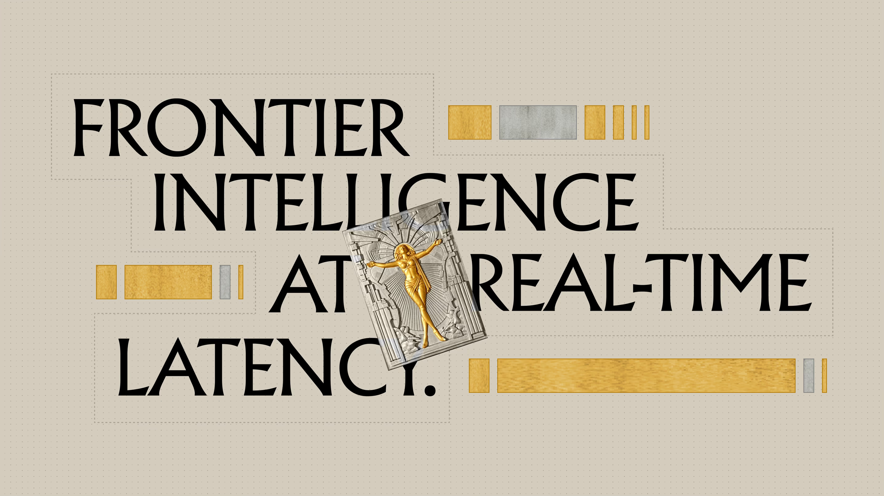
Together with the founders we locked the foundation: the coil mark, and a direction we called Art Deco × technical. Art Deco, after all, was a celebration of machinery and progress. The brand should feel like that: calm technical confidence, strong typography and precise geometry, in light and dark.
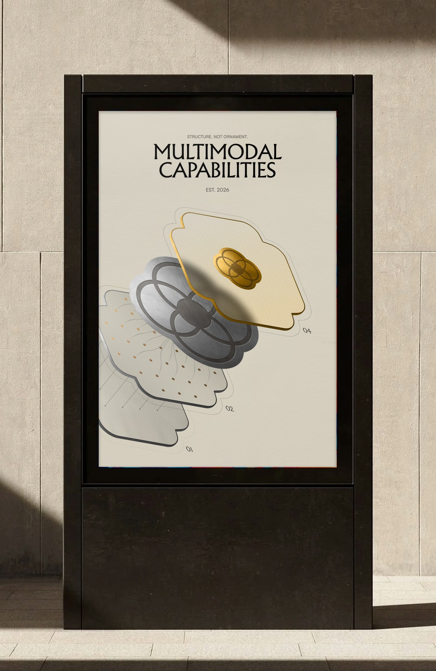
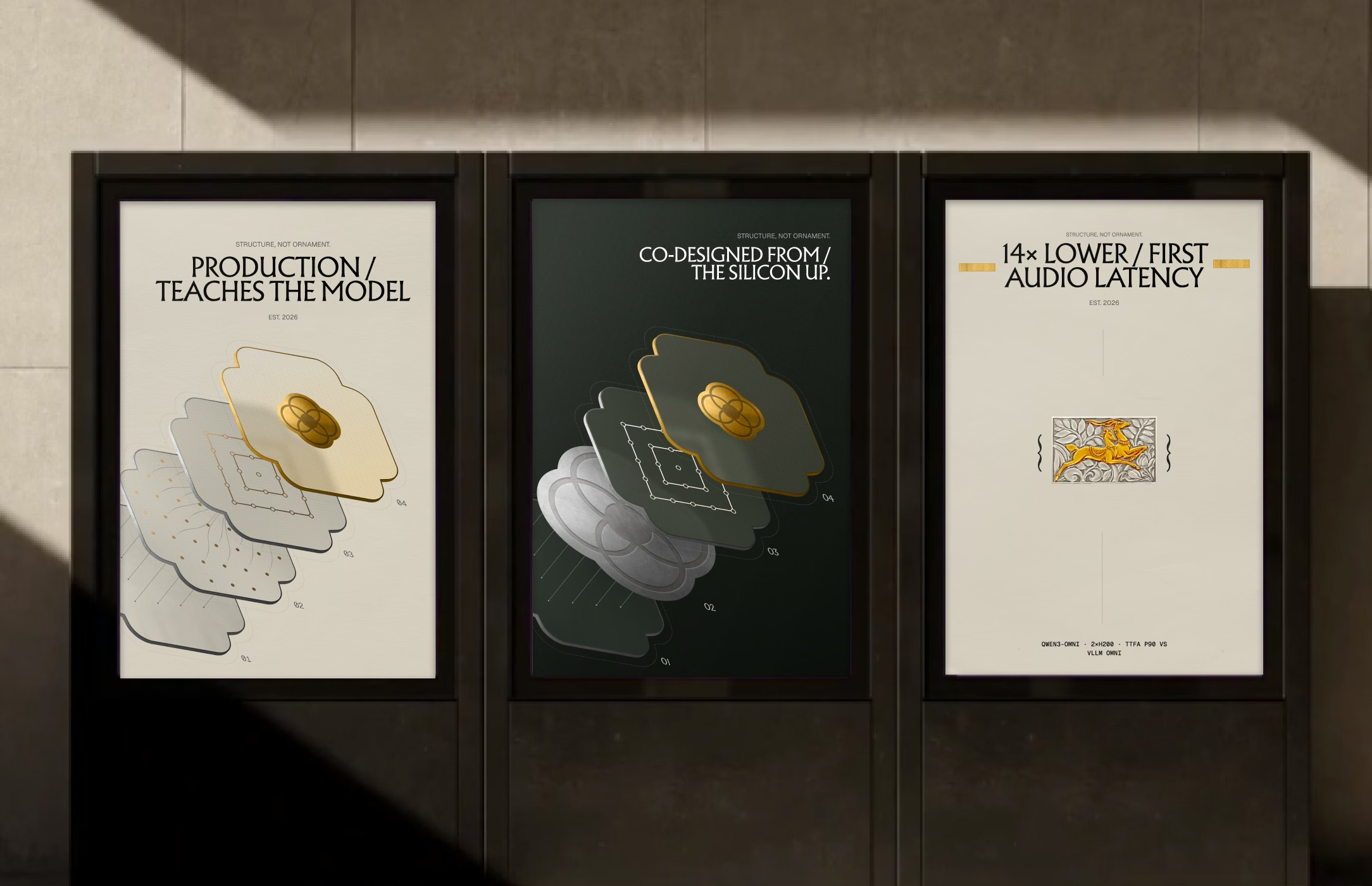
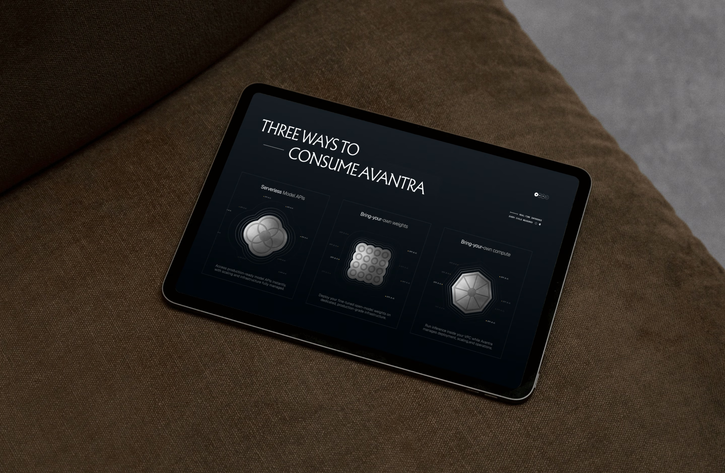
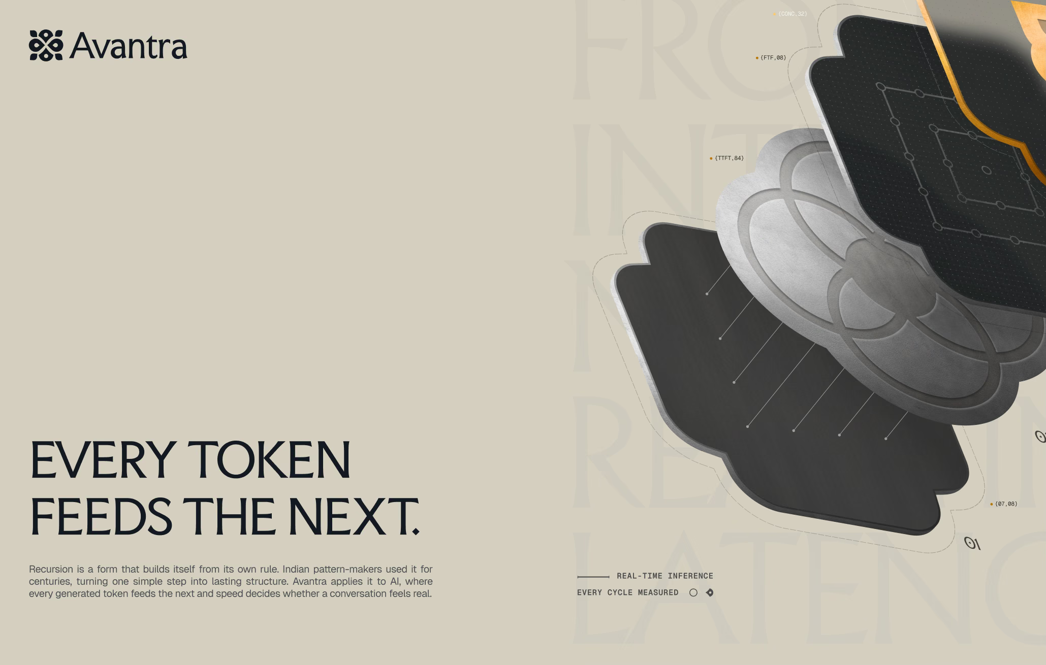
Gold, silver and obsidian became the materials, and every graphic got a job. A point is compute, a line is a stream, an unbroken line is the serving layer, a loop is a completed turn. The most important new piece was the isometric illustration: Avantra's cascaded stack in exploded view, speech-to-text, model and text-to-speech as layers of one serving system.
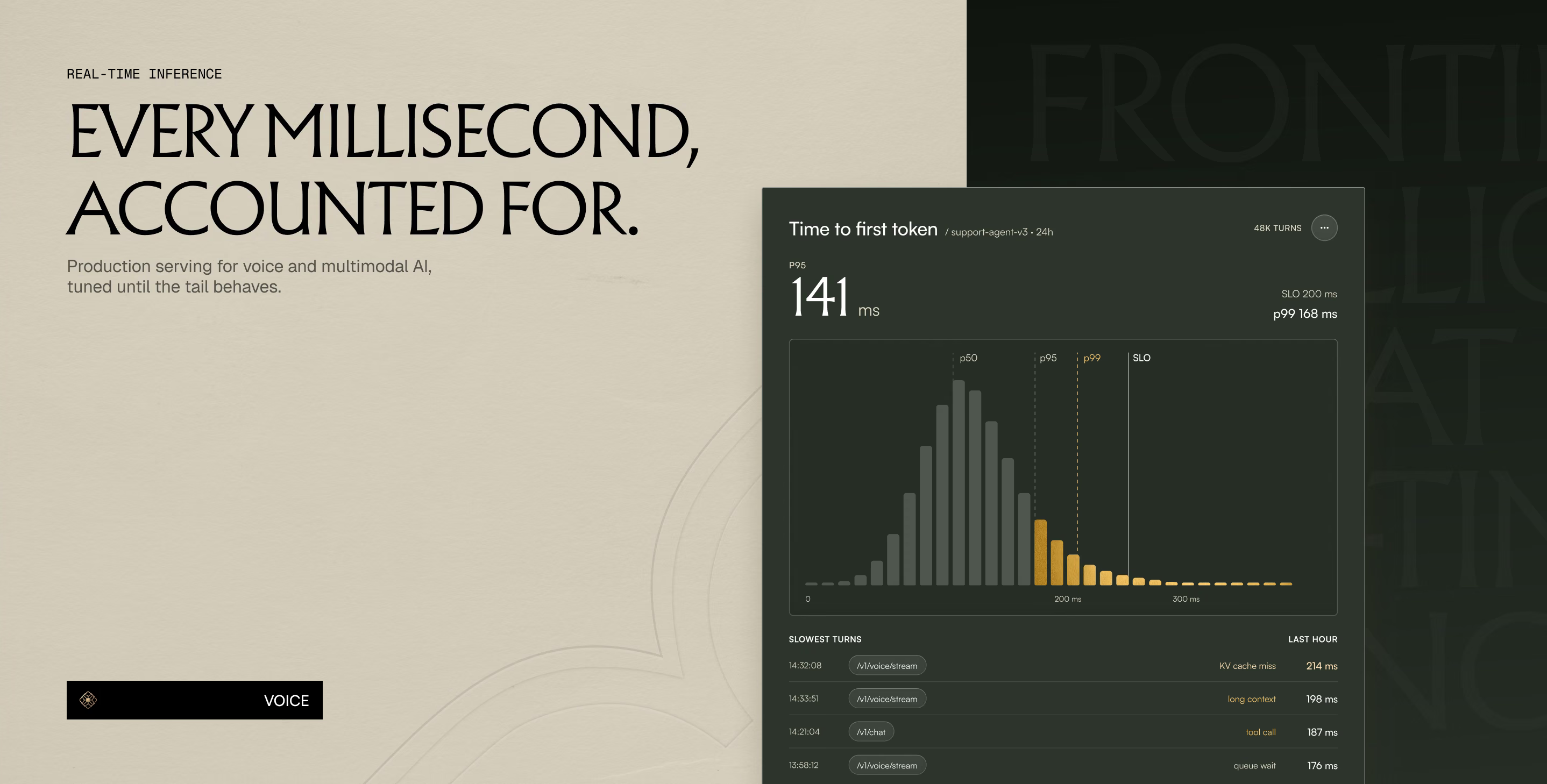
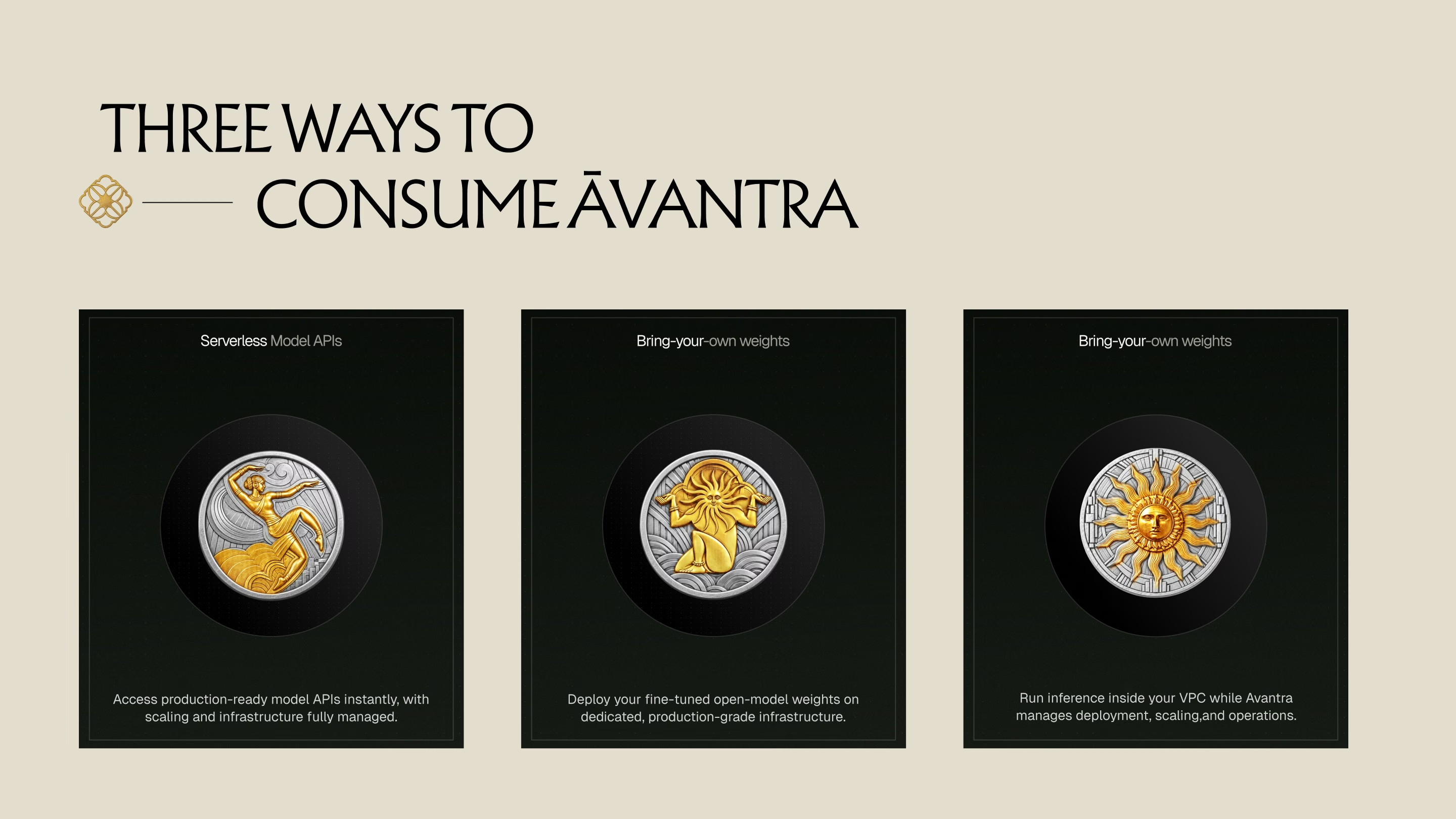
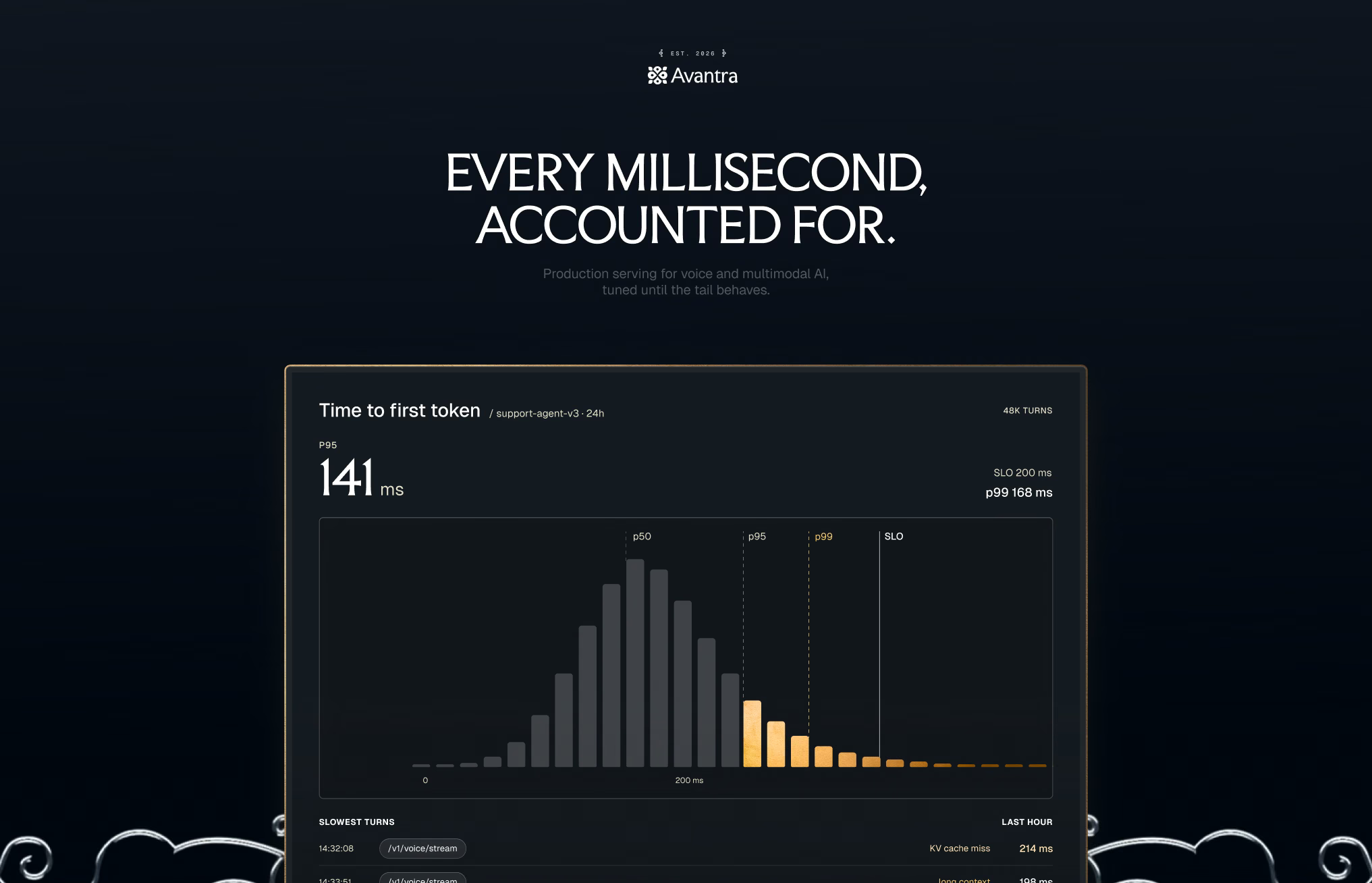
The characters survived only as small relief medallions. We pulled back the Indic ornament and brought voice and real-time interaction into the visual language through signals, charts and flow. Charts carry Avantra's proof, so they got the same care as the logo.
We also changed how we review. Every round is now judged on the same set of real touchpoints, a website section, a deck slide, social and a blog post, in both modes, shared a day ahead so each call ends with what is settled and what needs another pass.
Coil, stack and signals.
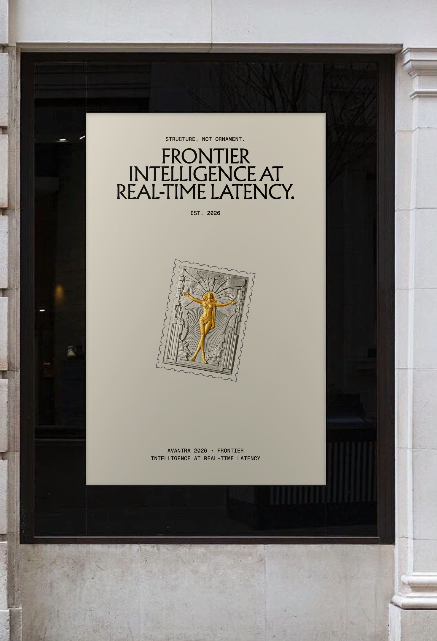
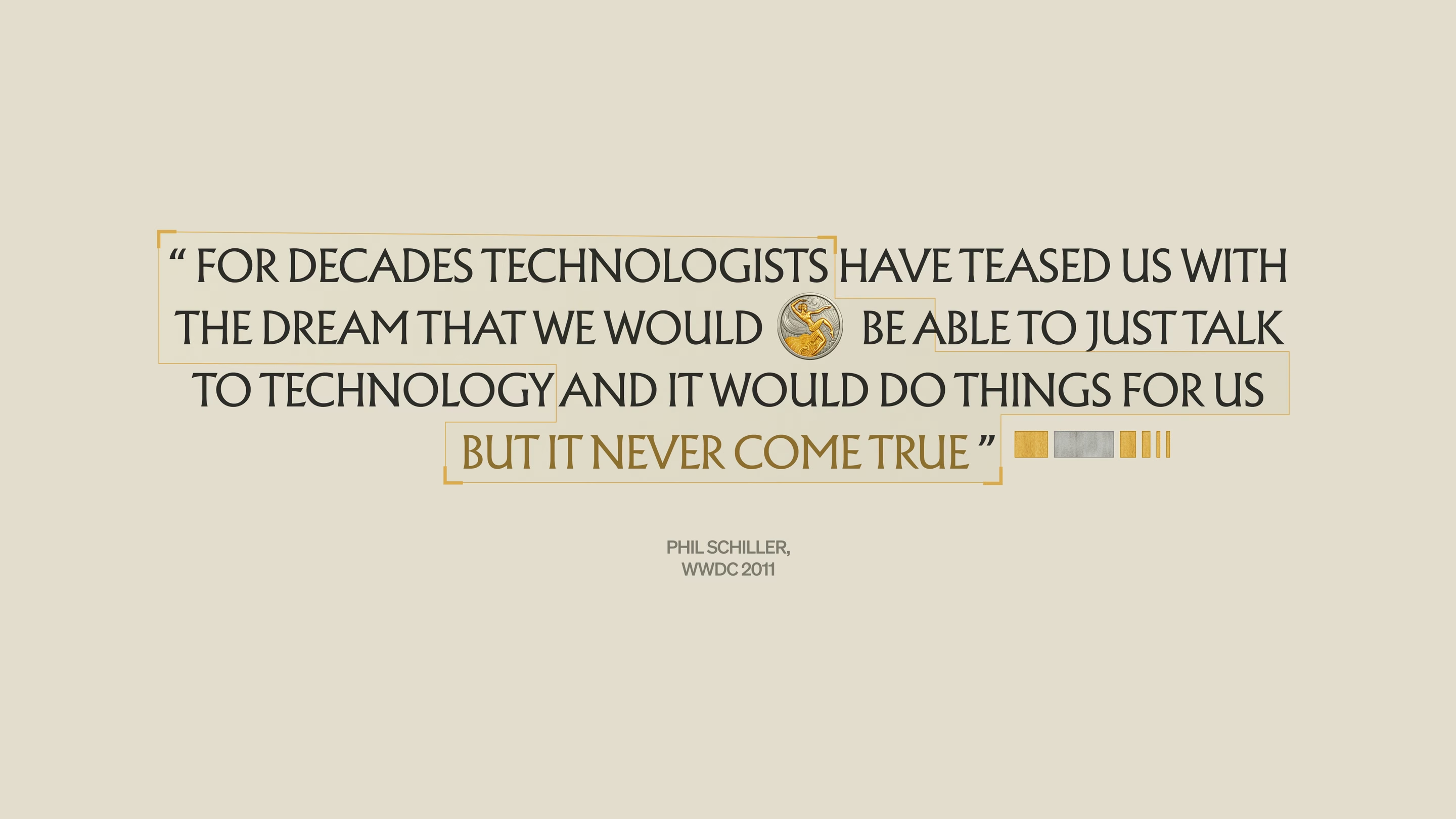
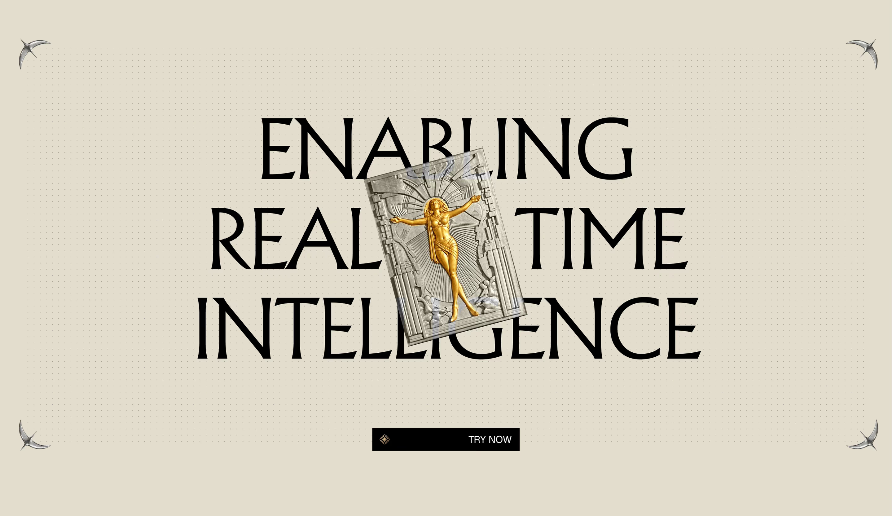
The coil mark on posters and signage, the exploded stack and the relief medallions, then the deck and website.

Iteration 5: the final direction.
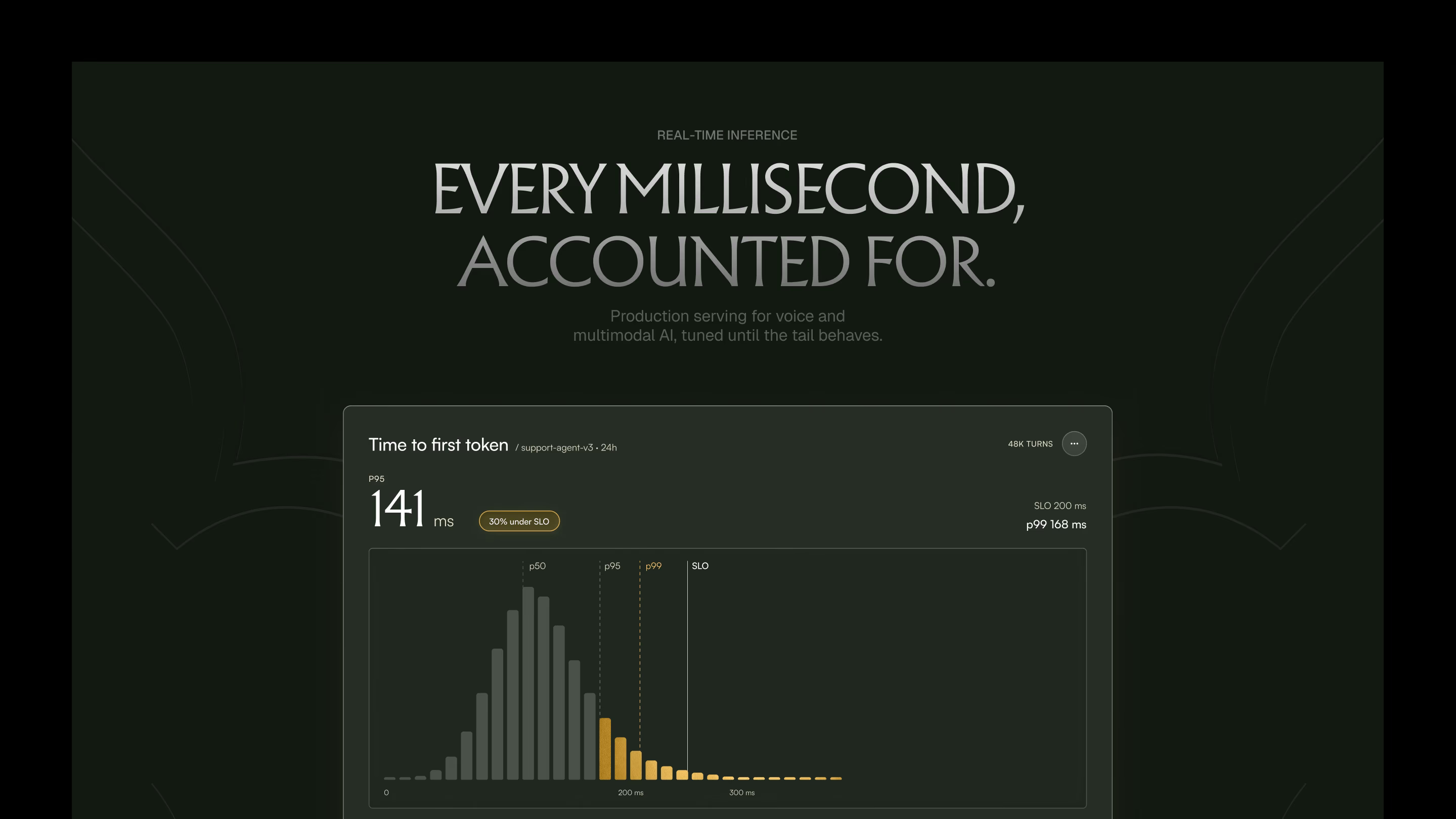
The latest round is one of the final directions. It takes Art Deco × technical onto a deep navy ground and lets the exploded stack lead: every layer carries a number, a label and a measurement.
We animated the stack in Figma for social and the website. Layers drop into place one at a time, the way a response is assembled token by token, and the labels arrive last, like readings on a trace.
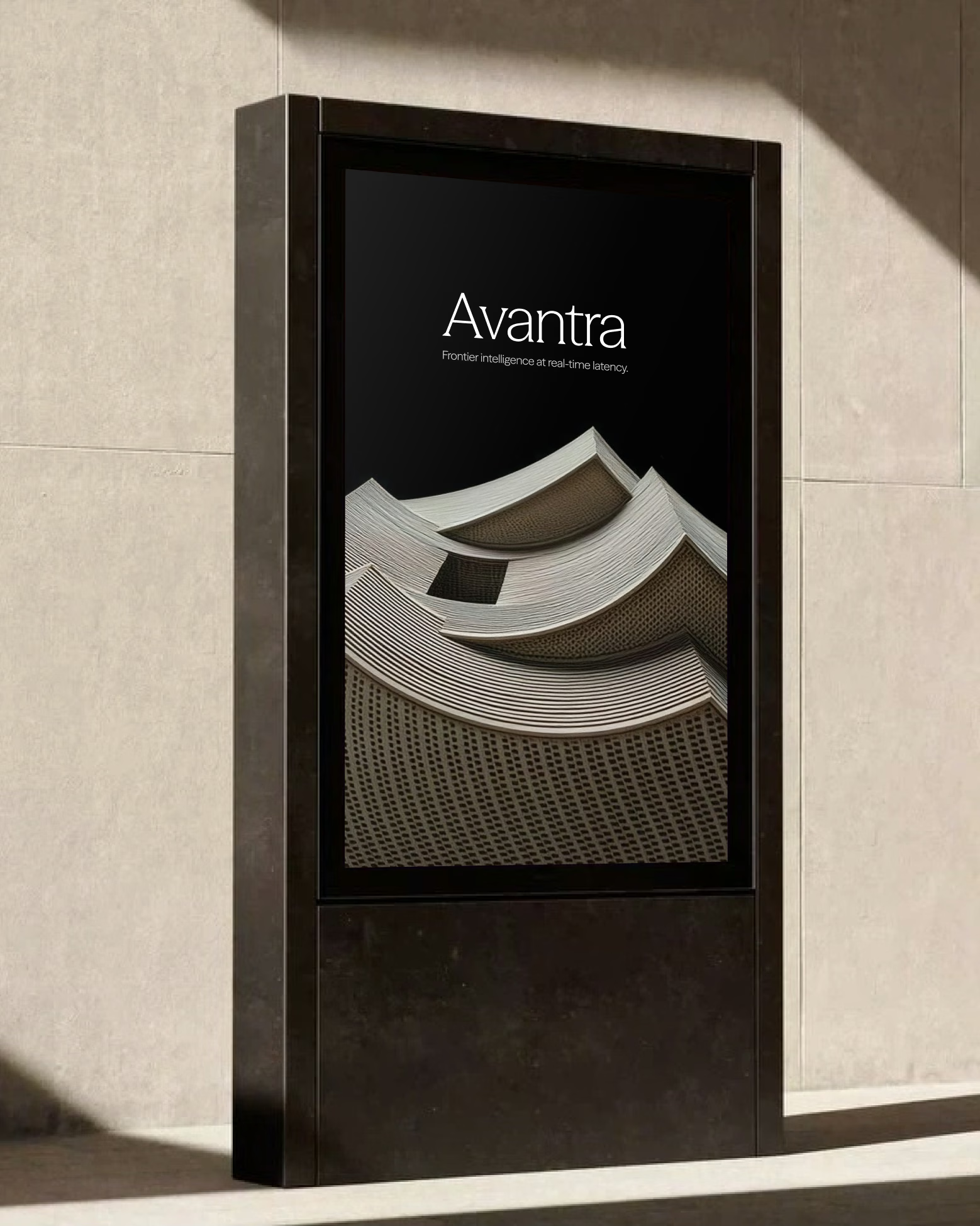
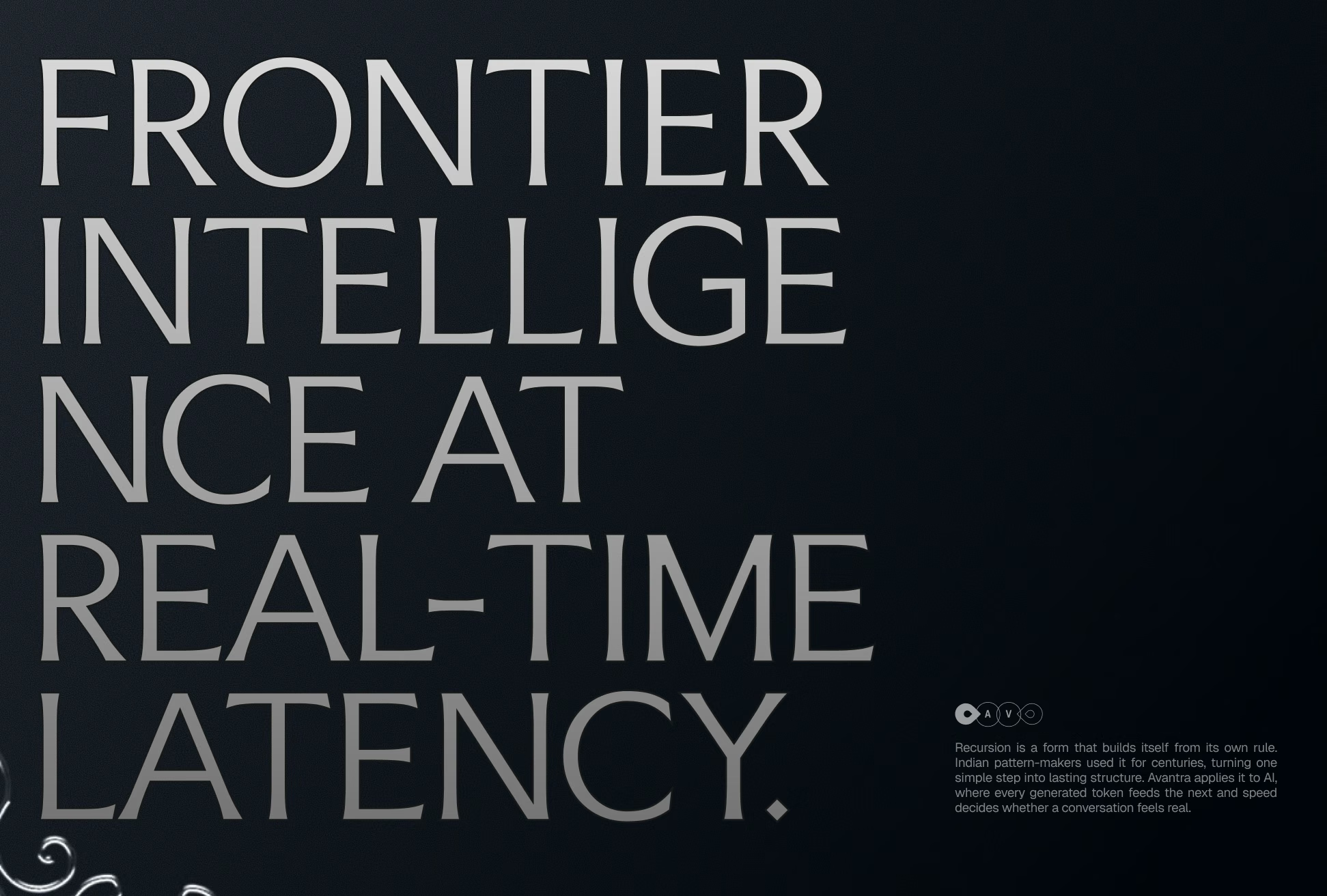
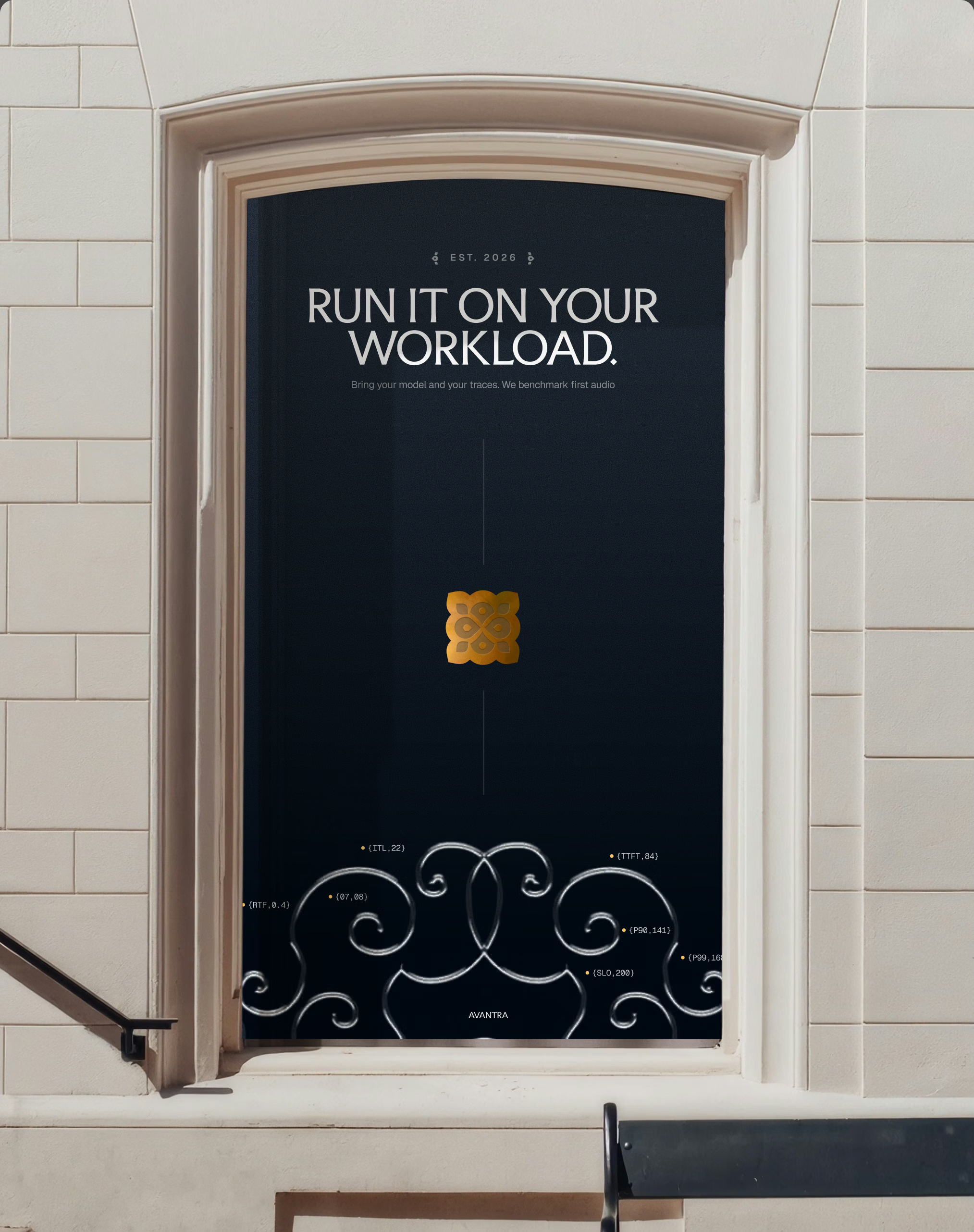
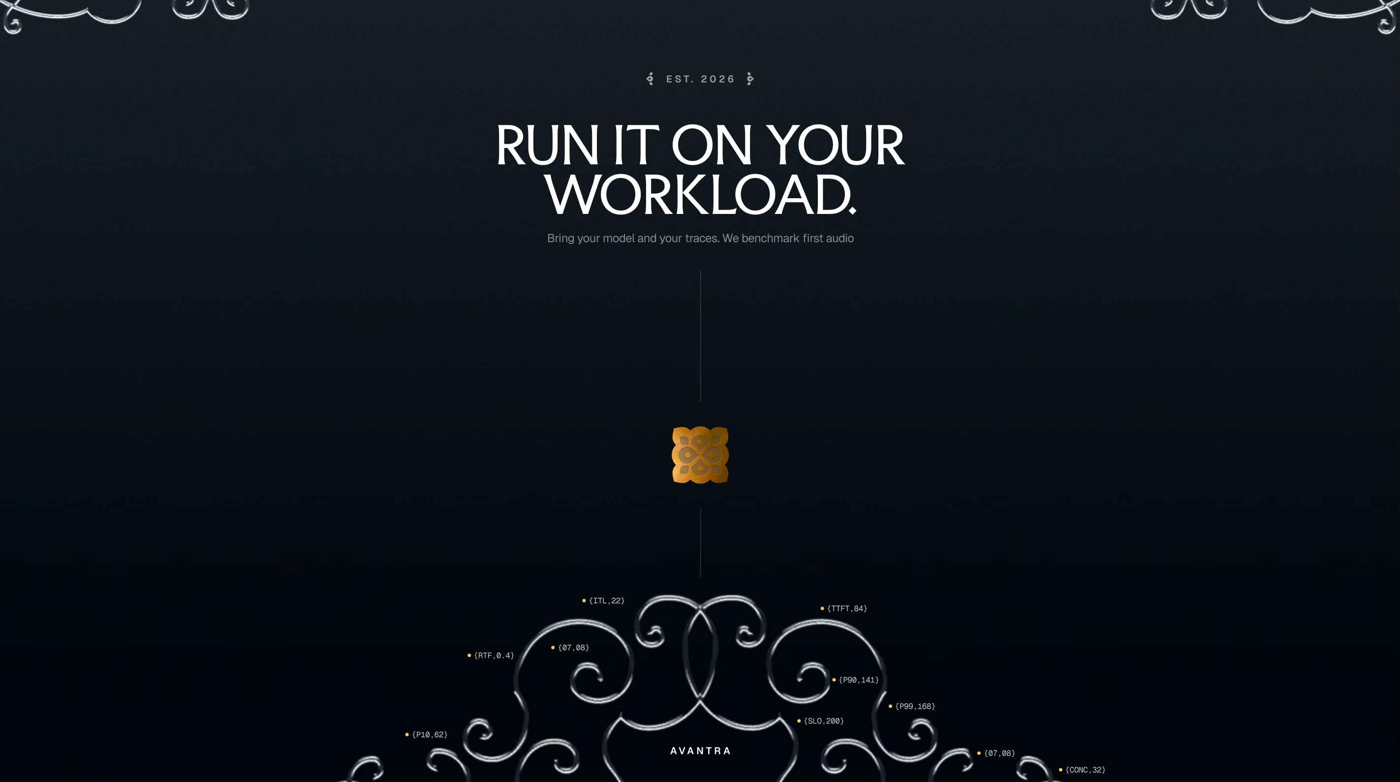
The same system runs through social, the deck, the latency chart and out-of-home, down to a single line, 'Run it on your workload', on a navy door.
Stack, signals and launch.
The exploded stack in motion, then the launch posts, slides and out-of-home.

Where Avantra is now.
This one is still in progress. The direction is locked as Art Deco × technical: deep navy, gold and silver, the layered isometric stack, the glyph system and voice-led radial geometry.
Next up is a focused round on the logo and wordmark, an accent palette for charts and actions in light mode, then the component library and design.md the team will build from.
Brand identity, deck, memo and website design by PIXELUP LABS, 2026.
Want to talk about your own brand? Book a call.
Frequently asked questions
PIXELUP LABS is designing Avantra's brand identity in 2026: strategy and moodboards, two visual directions, the logo and wordmark, an illustration and glyph system, deck and memo templates, and website explorations.
We build brands, websites and products for startups that need to command enterprise trust. Brand identity, website design, product design, design systems, motion and sales assets, all designed together as one system.
Greptile doubled demo requests in week one and raised a $25M Series A within six months of launch. Sully scaled 26x in 11 months after its redesign. Sainapse relaunched ahead of general availability and is now deployed by Fortune 500 companies including Ford and Freshworks.
Brand sprints take 2–4 weeks. Brand plus website projects take 6–8 weeks from kickoff to launch. We regularly deliver under hard deadlines like fundraise announcements and launch dates.
Brand sprints are $15,000. Brand plus website projects run $25,000 to $40,000. Retainers start at $6,000 a month. See current services and pricing on Contra.
You work directly with the team on Slack, with fast turnarounds and quick iterations. No account managers, no layers, no surprises.
Rarely. Most clients come to us with something functional that no longer matches their ambition. We keep what works and rebuild what holds you back.
Book a discovery call or message us on Telegram. We will review where you are today and tell you honestly what we would change.