Series A · Legal AI
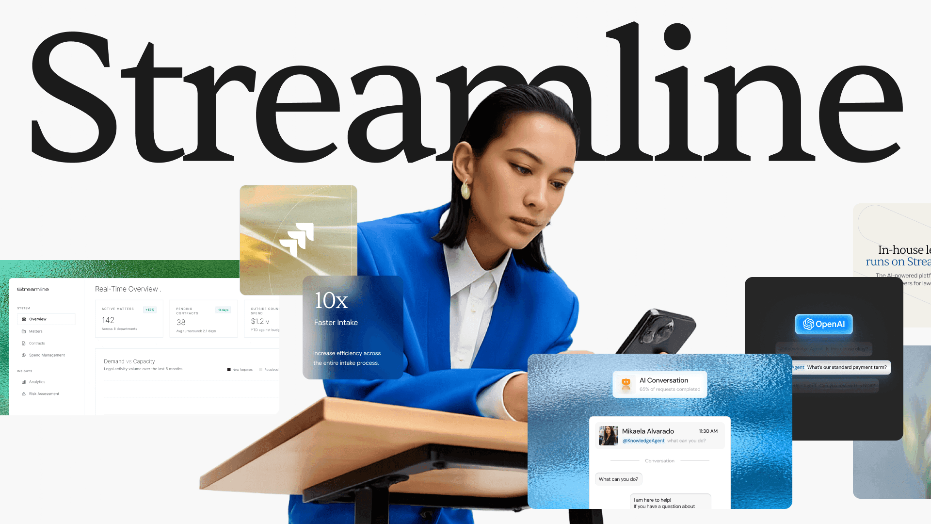
We repositioned Streamline for enterprise, then scaled the brand across 200 pages.
Client
Year
Involvement
Brand Identity,
Positioning,
Website Design,
Design System,
Webflow Development
Link
40+
Unique page designs
200+
Pages on one system
100+
Touchpoints
F500
Enterprise conversations
Why the old brand was no longer a good fit.
Where Streamline was
Streamline had a mature AI platform built for enterprise legal teams. The product was getting better and the company was moving into bigger accounts.
What the market looked like
When we looked at the competition, some newer competitors simply looked more modern, more credible and more enterprise-ready.
How we found the gap
We went deep into the business: a brand workshop with the team, a study of the competitive landscape, a map of their buyers, and time spent understanding the product.
Why it mattered
The gap became obvious. Their brand system was holding them back, and that mattered even more because Streamline was selling to Chief Legal Officers, General Counsels, legal ops teams and legal teams inside large companies.
Critical challenge
01 / 02
Our first instinct was to make Streamline much bolder.
Problem
If the old brand was underselling the product, the new one needed to make a much stronger statement. So we explored three creative directions: more colour, more gradients, more conceptual imagery, more personality.
Why it mattered
After the first round of feedback, we realised we had pushed too far. The new directions felt modern, but they no longer looked like a company built for enterprise legal teams. They were not lawyer-like.
What we did
The answer was not to make Streamline as different as possible. It was to make them feel modern without losing the trust their buyers expected. The question changed from how bold we could make Streamline to how modern we could make it without losing the maturity the product already had. The brief became: legal-tech serious, modern flavour.
Outcome
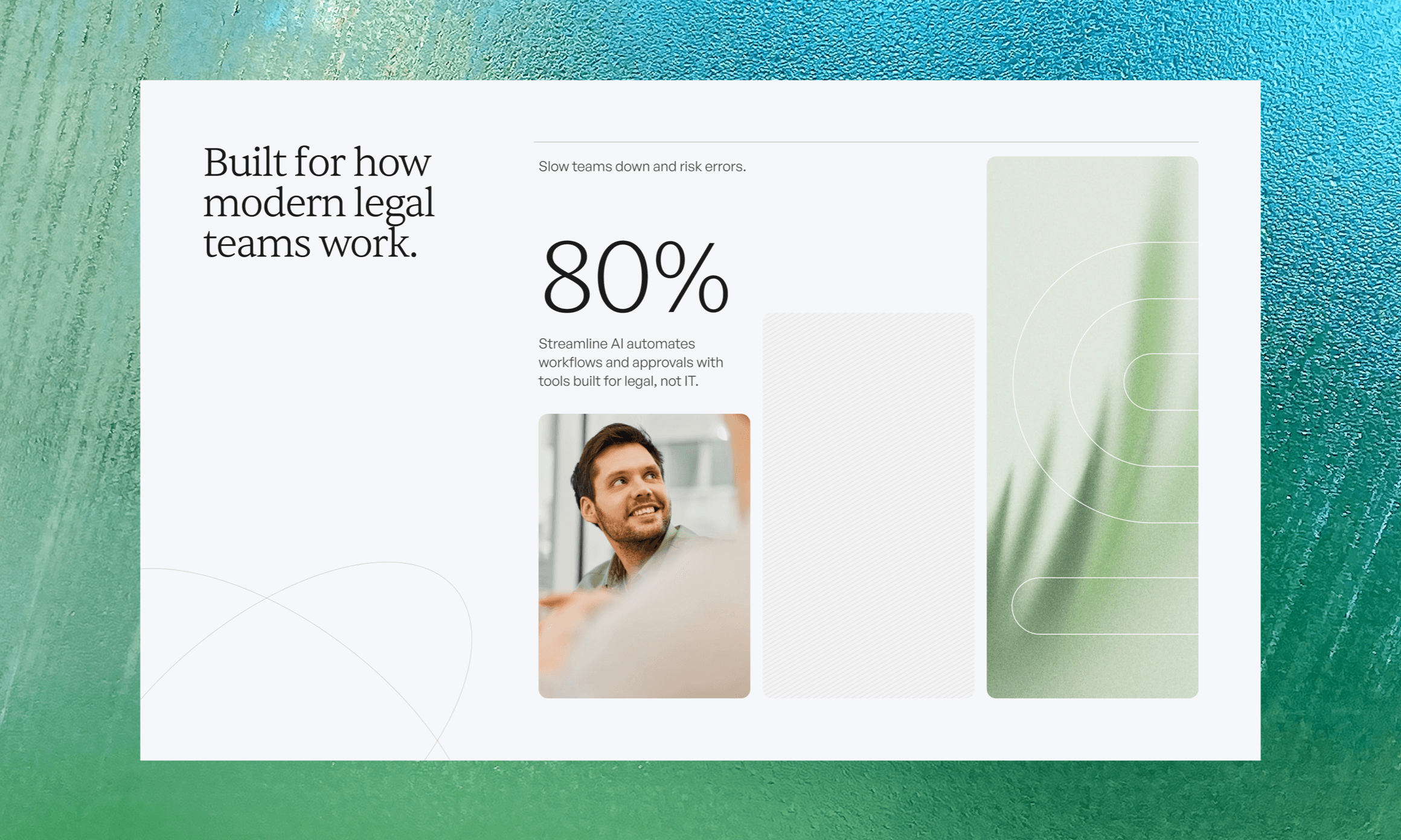
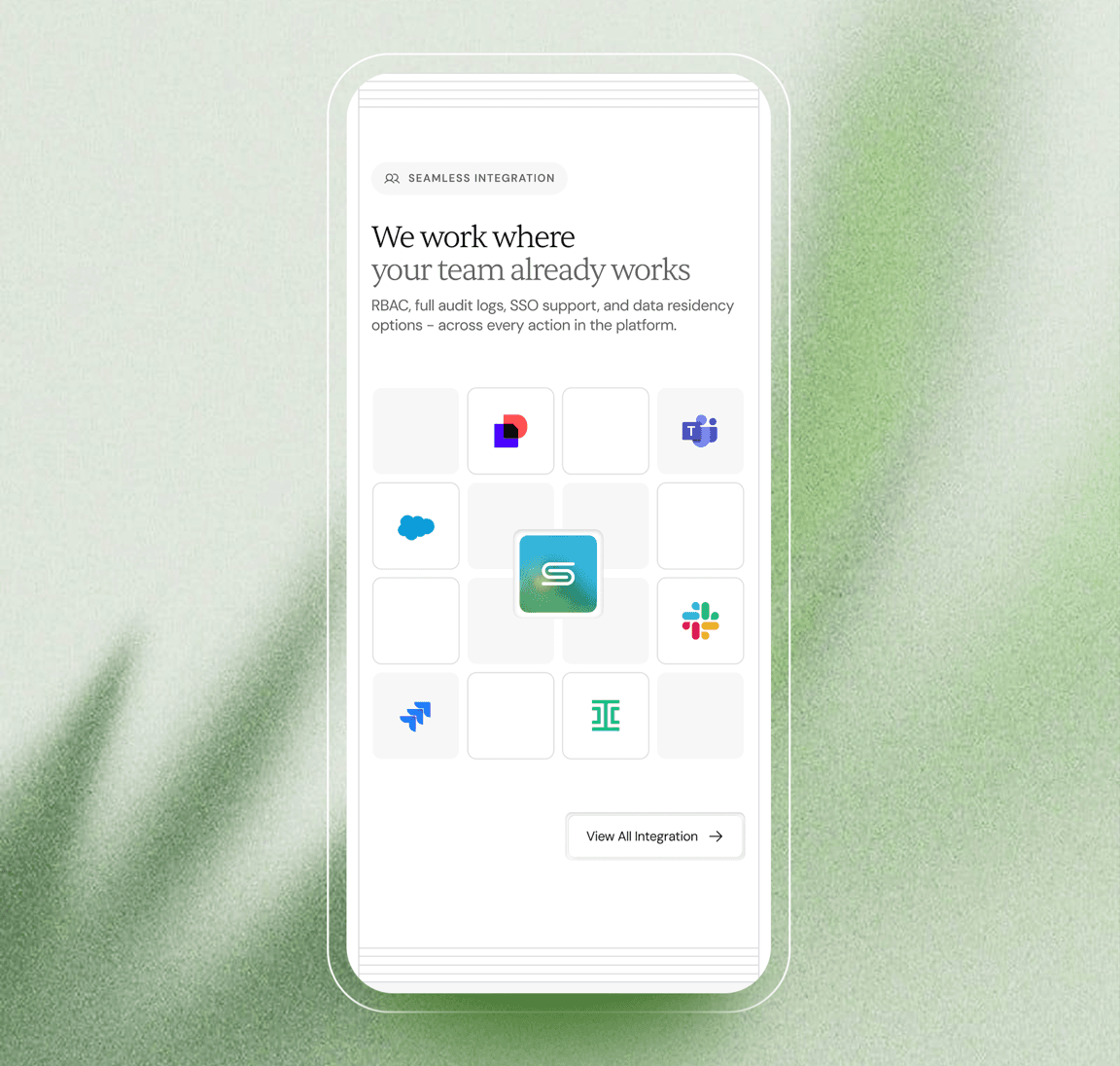
That principle guided every decision from there. Royal blue became the primary colour and leaf green the secondary. Neutrals did a lot of the work. Product and illustration supported the copy instead of overpowering it, and gradients and textures stayed but became more subtle.
Critical challenge
02 / 02
Getting the brand right was only half the job.
Problem
Finding the right visual direction solved the perception problem. The next challenge was making it work across the entire website and every marketing touchpoint.
Why it mattered
Streamline did not need a five-page marketing site. The project grew to 40+ unique page designs, with the system extending across 200+ pages. A page written for a General Counsel had to tell a completely different story from an AI Contract Review page.
What we did
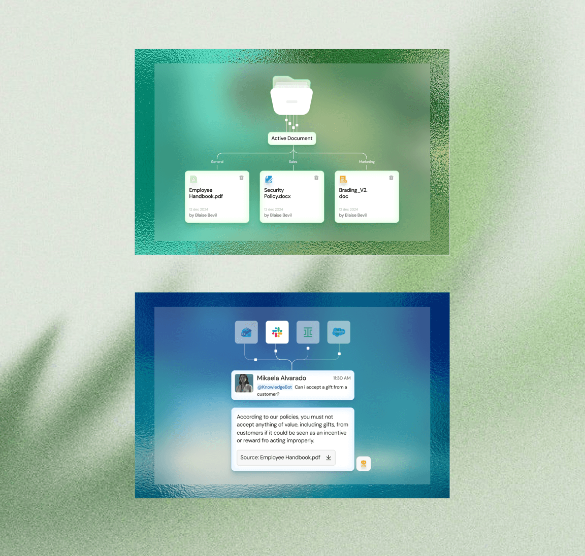
We turned the brand into a design system: reusable components, page structures, product templates, design rules and an illustration system that could stretch across the whole website. The illustrations had to support dozens of different ideas without making every page feel disconnected.
Outcome
By this point we were not just designing a new brand. We were building a system Streamline could keep using as the company grew.
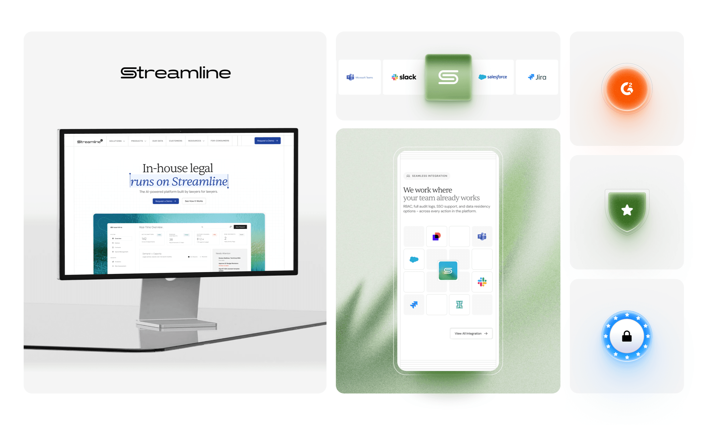
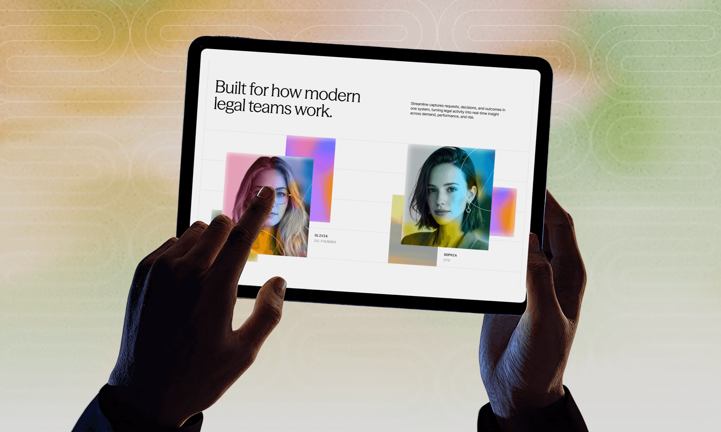
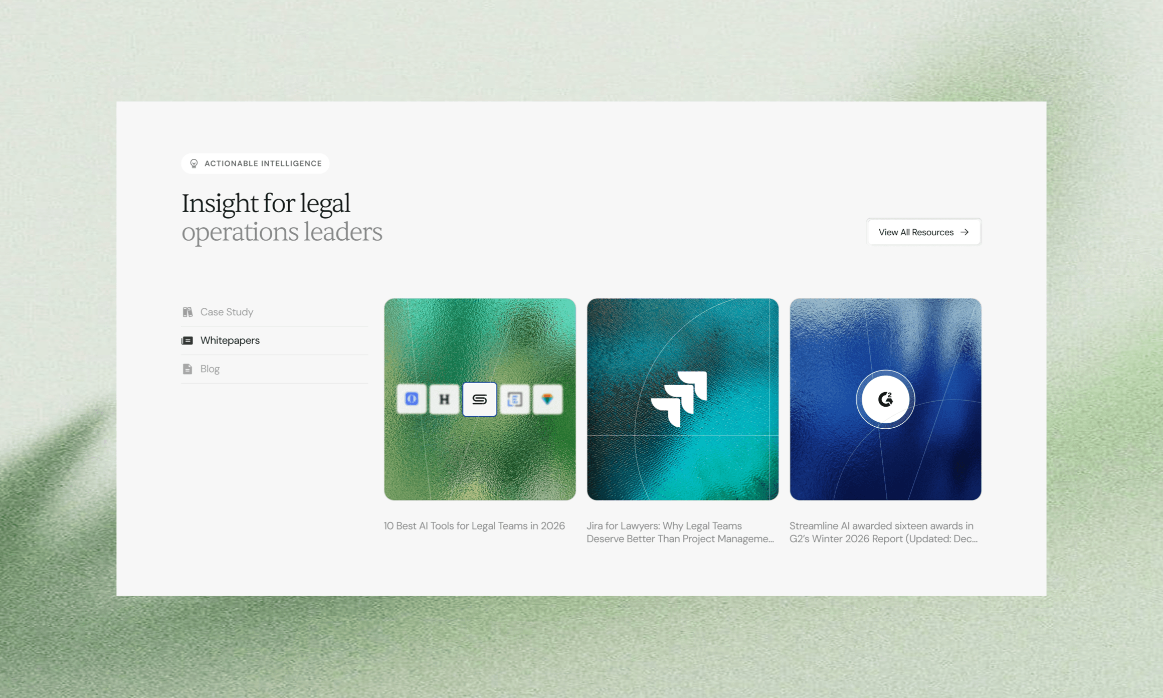
One system, 200+ pages.
Product, feature, industry, team and resource pages all run on the same components, so a General Counsel page and an AI Contract Review page can tell different stories without looking like different companies.
Results
40+
Unique page designs
200+
Pages on one system
100+
Touchpoints
F500
Enterprise conversations
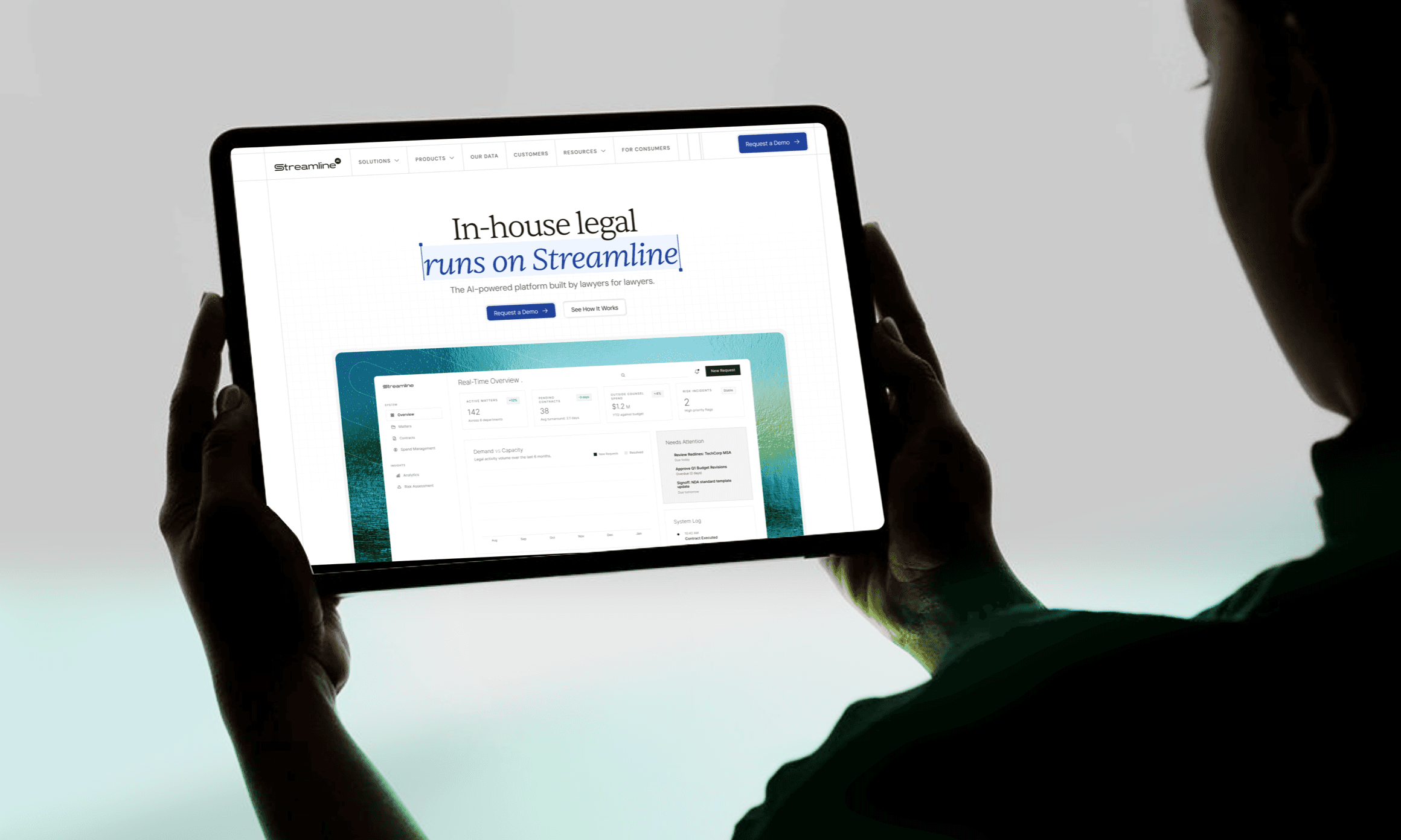
And this is where Streamline ended up.
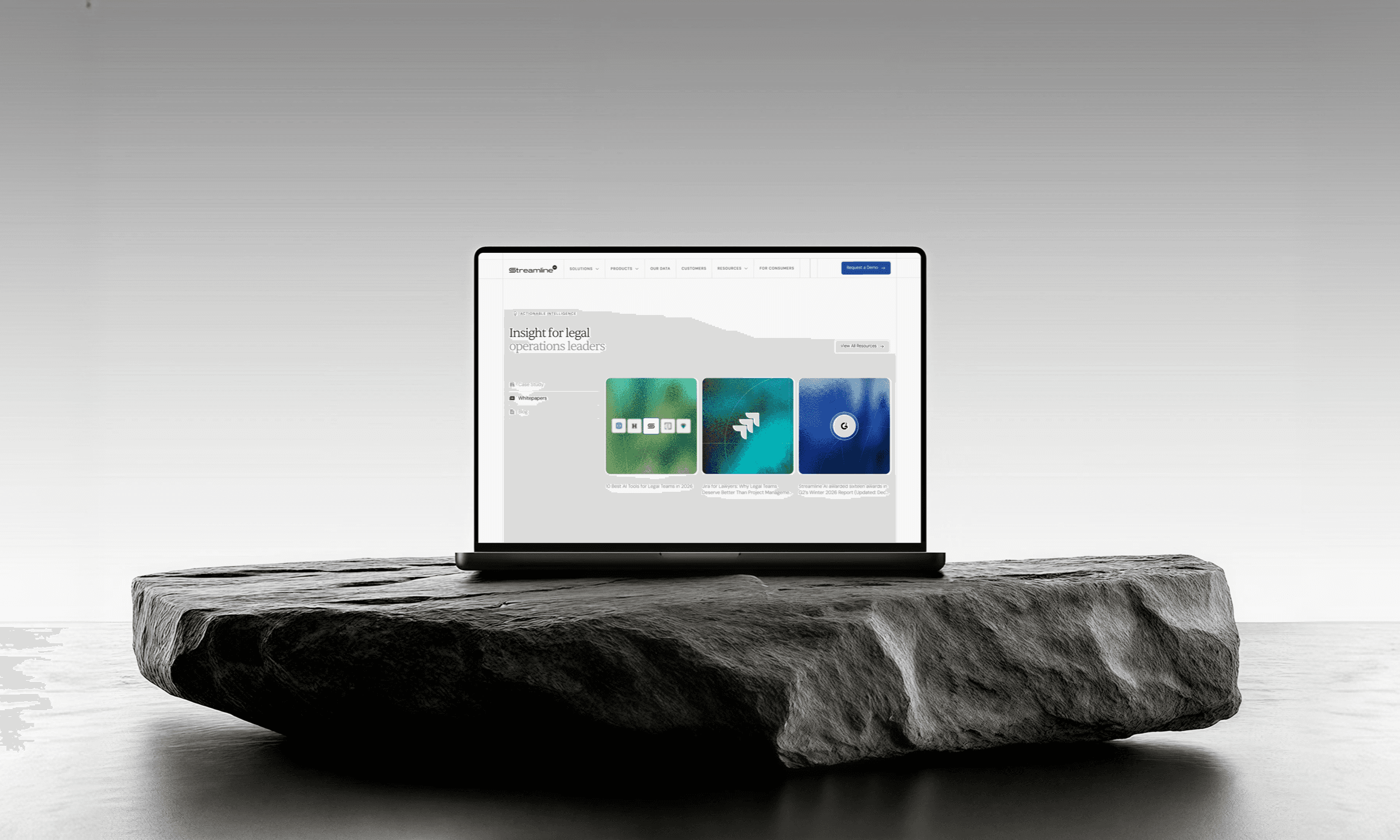
Streamline had much more than a new homepage. They had a brand that finally matched the maturity of the product behind it, a design system that could extend across all the touchpoints, and a website built around the perception they needed with enterprise legal buyers.
After launch, the team also reported positive customer feedback and stronger enterprise conversations, including with Fortune 500 companies. You can see the live site at streamline.ai.
If you recognised Streamline's problem in your own company, we should talk. We work with AI and B2B SaaS teams on brand, web and product design, helping them move upmarket.
Frequently asked questions
We build brands, websites and products for startups that need to command enterprise trust. Brand identity, website design, product design, design systems, motion and sales assets, all designed together as one system.
Greptile doubled demo requests in week one and raised a $25M Series A within six months of launch. Sully scaled 26x in 11 months after its redesign. Sainapse relaunched ahead of general availability and is now deployed by Fortune 500 companies including Ford and Freshworks.
We work on startup timelines. Most engagements ship in weeks, not months, and we regularly deliver under hard deadlines like fundraise announcements and launch dates.
Brand sprints are $15,000. Brand plus website projects run $25,000 to $40,000. Retainers start at $6,000 a month. See current services and pricing on Contra.
You work directly with the team on Slack, with fast turnarounds and quick iterations. No account managers, no layers, no surprises.
Rarely. Most clients come to us with something functional that no longer matches their ambition. We keep what works and rebuild what holds you back.
Book a discovery call or message us on Telegram. We will review where you are today and tell you honestly what we would change.