Agentic commerce · Checkout
We built the Henry Labs brand, then carried it across every touchpoint.
Client
Year
Involvement
Positioning,
Brand,
Website,
Product,
Webflow Development
Funding
Why the brand was behind the company.
Where Henry Labs was
Henry Labs builds checkout for AI shopping apps. Visa had already cited their one-click checkout, and they were a founding member of the Agentic Commerce Consortium.
What the market looked like
Agentic commerce was filling up fast with startups that all sounded the same. Platforms choosing a checkout partner could not tell them apart.
How we found the gap
A competitor analysis and a product deep dive showed what Henry Labs really sells: an SDK platforms build on, not a shopping app.
Why it mattered
Platforms trust Henry Labs with their transactions and revenue. The company had earned that trust. The brand still looked early-stage.

Critical challenge
01 / 02
Shoppers see the Henry button. Platforms sign the contract.
Problem
Shoppers meet Henry Labs as a checkout button. Platforms meet it as infrastructure they trust with revenue. A shopper-first brand would look forgettable to the actual buyer.
Why it mattered
The founders wanted ethereal and technical, not consumer. Too soft reads like a shopping app. Too cold looks like every payments API.
What we did
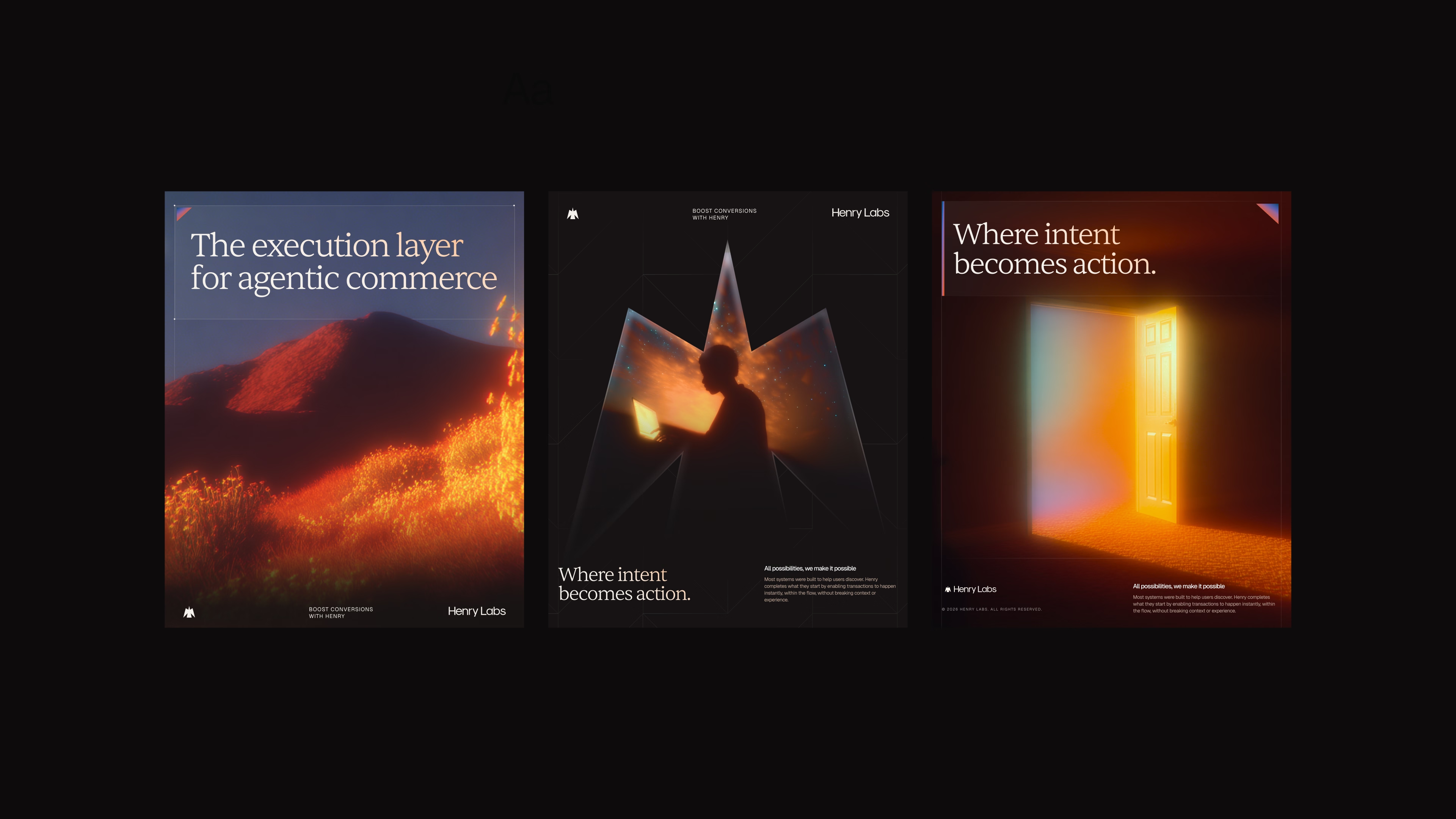
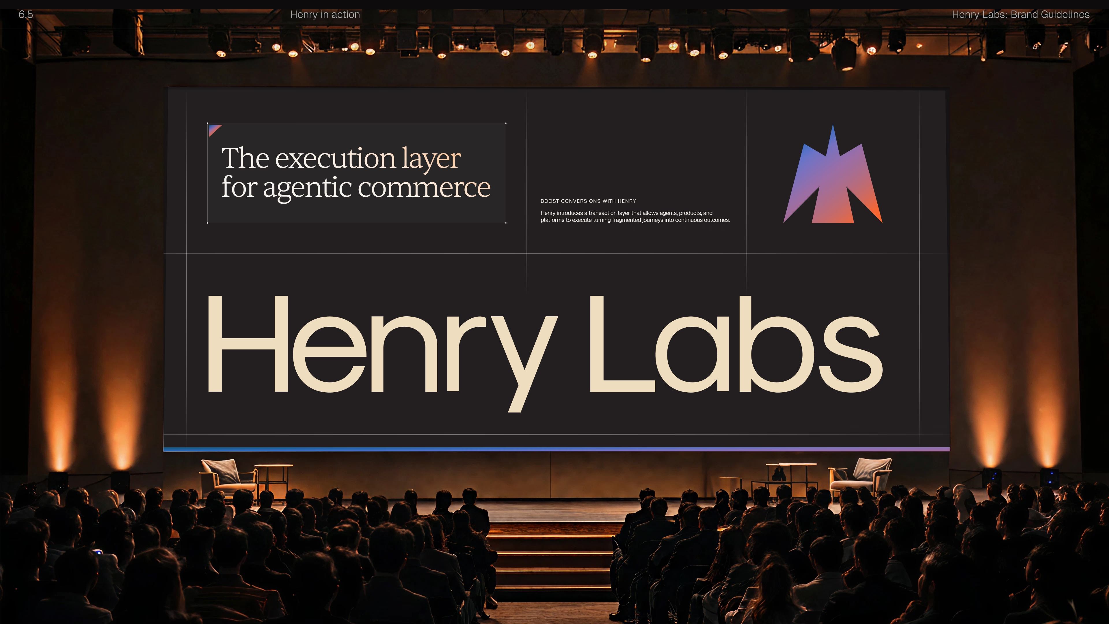
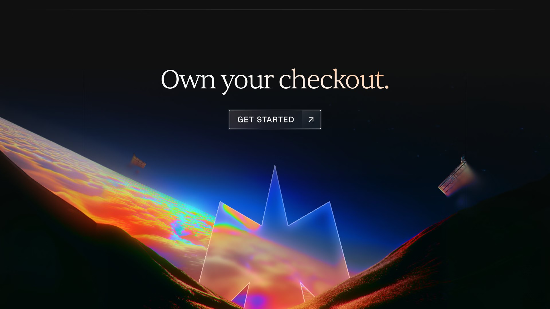
We designed for the platform buyer first. Landscape imagery and a sunset palette carried the ethereal. Precise type, grids and real product UI carried the technical.
Outcome
One identity quiet enough to sit inside another company's checkout, and serious enough for a partner pitch.

Critical challenge
02 / 02
Then the brand project turned into a product project.
Problem
A month into the brand work, Henry Labs asked us to design the product too: checkout and the partner dashboard, in a four-week sprint.
Why it mattered
Partners wanted sales, traffic and referrals at a glance. The old dashboard buried all three. Shoppers just wanted to buy.
What we did
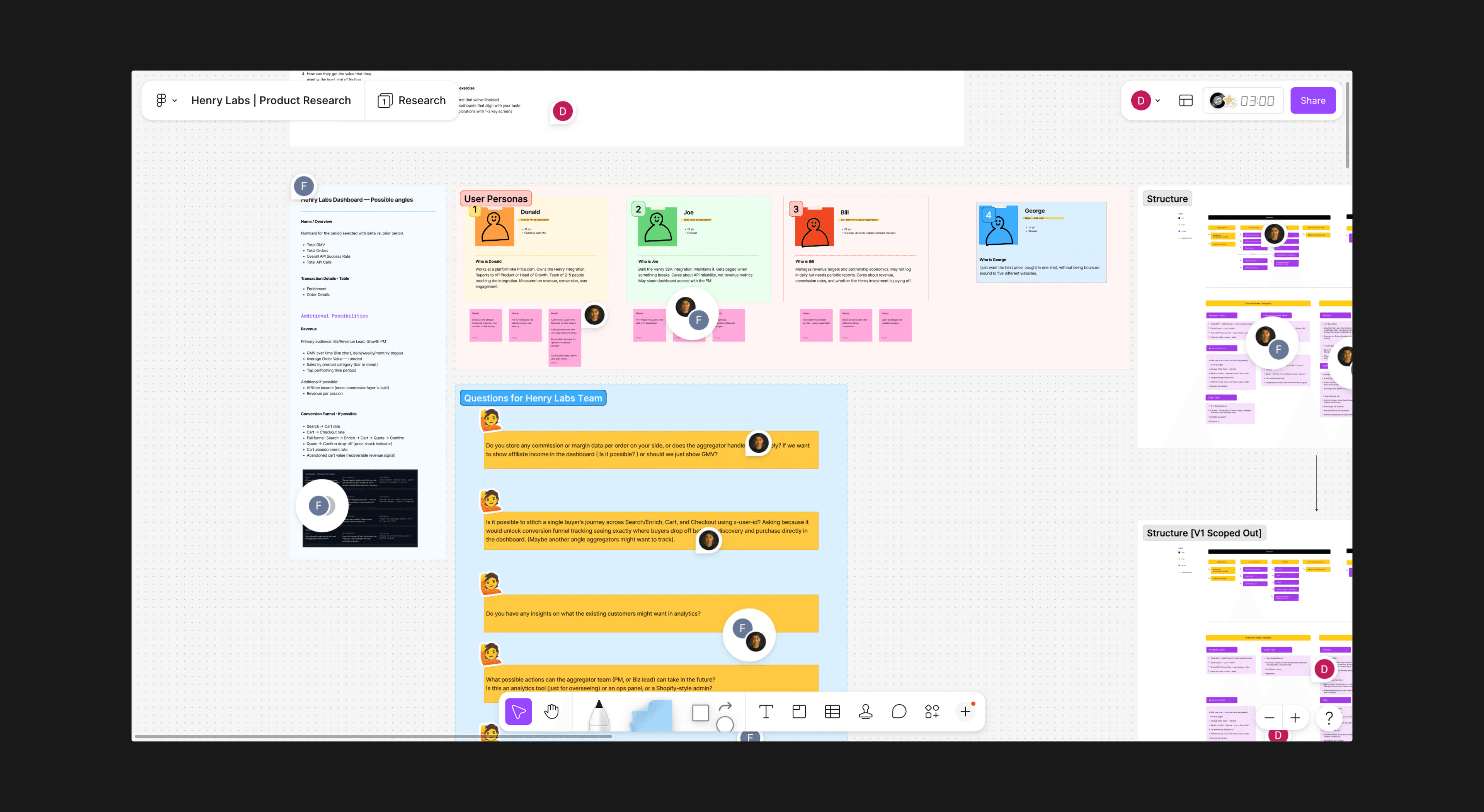
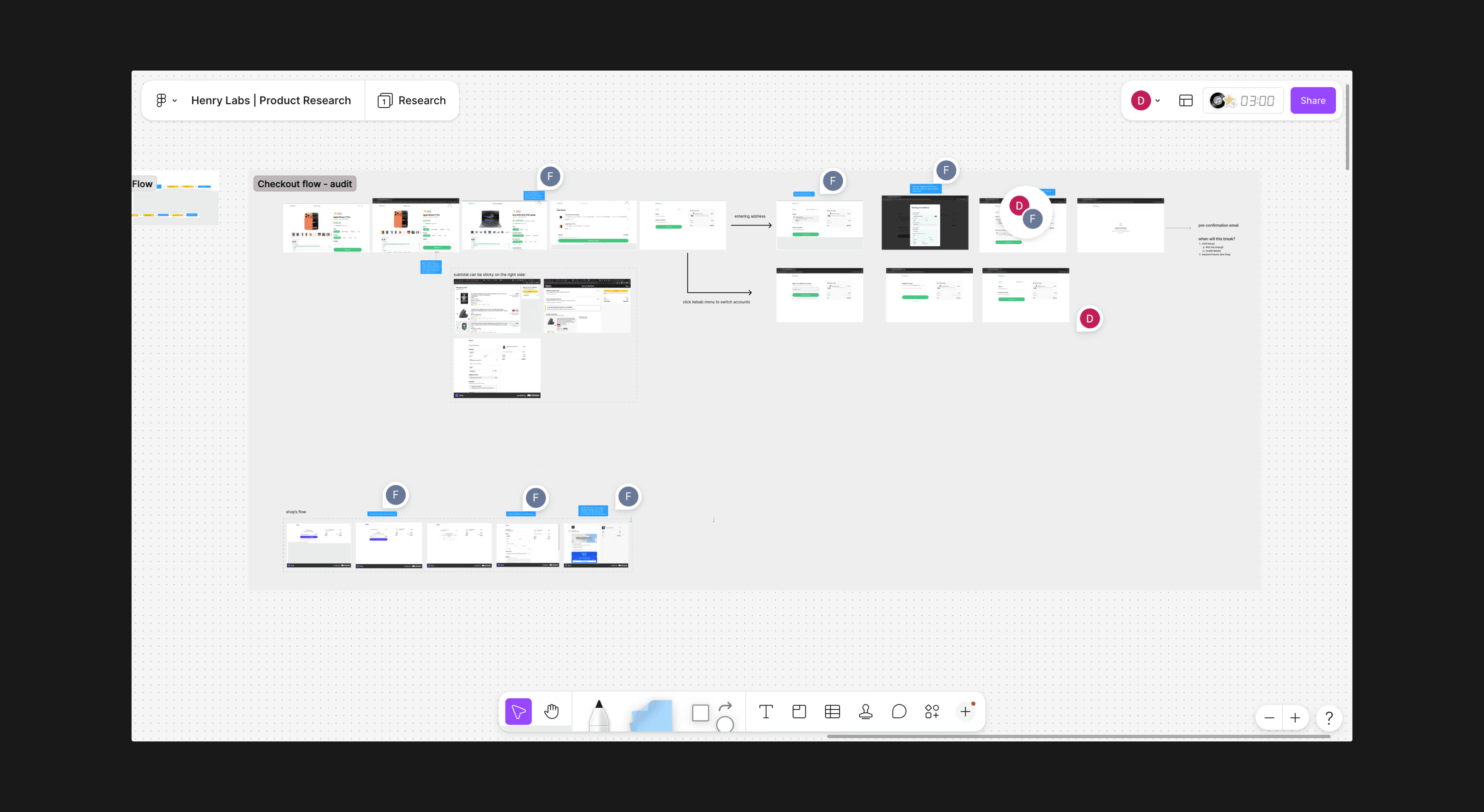
We mapped both personas, audited the checkout flow and designed checkout first, handing it to their engineers mid-sprint.
Outcome
One design system, two hierarchies. Partners see revenue first. Shoppers see their cart.
One brand, three products.
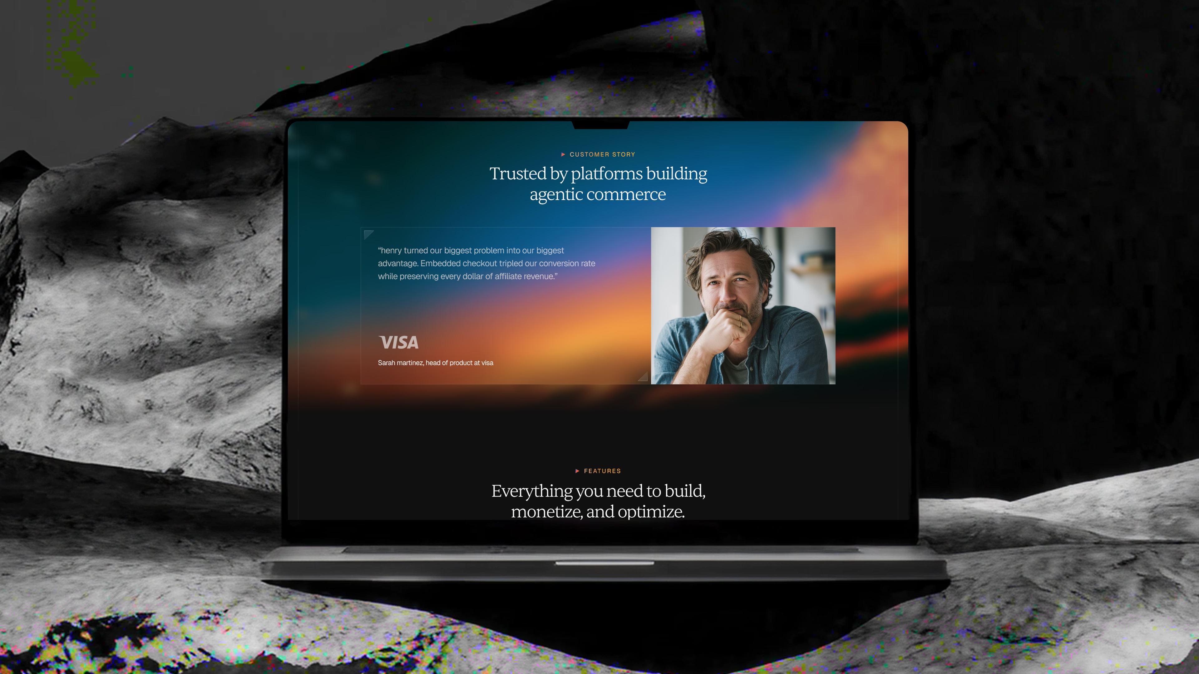
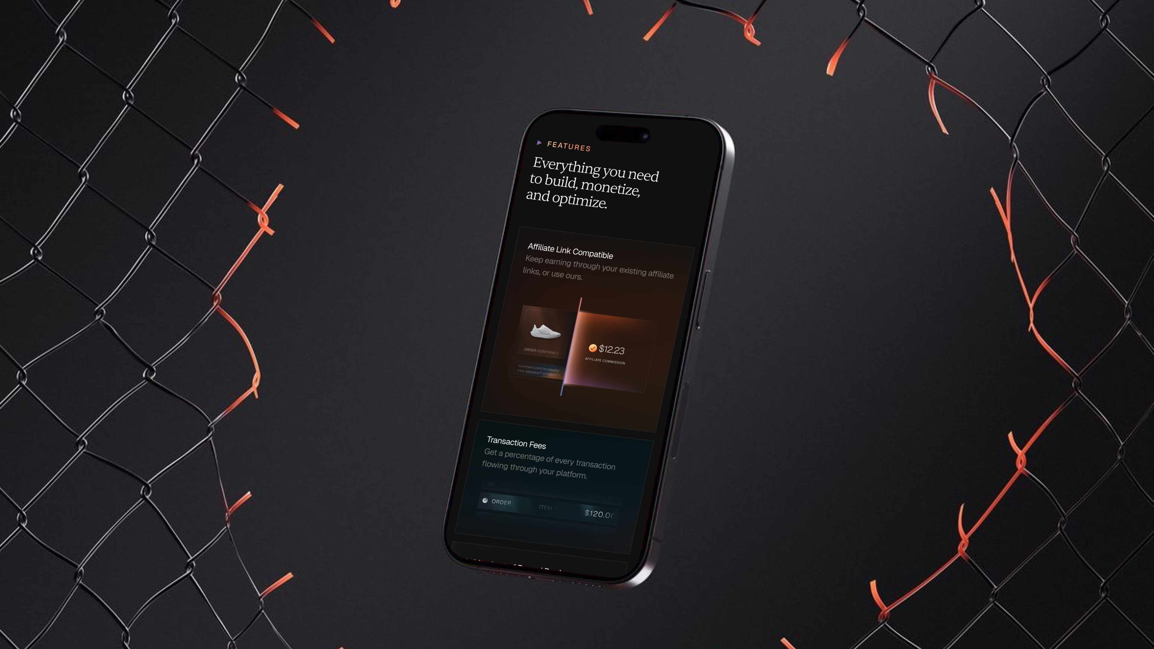
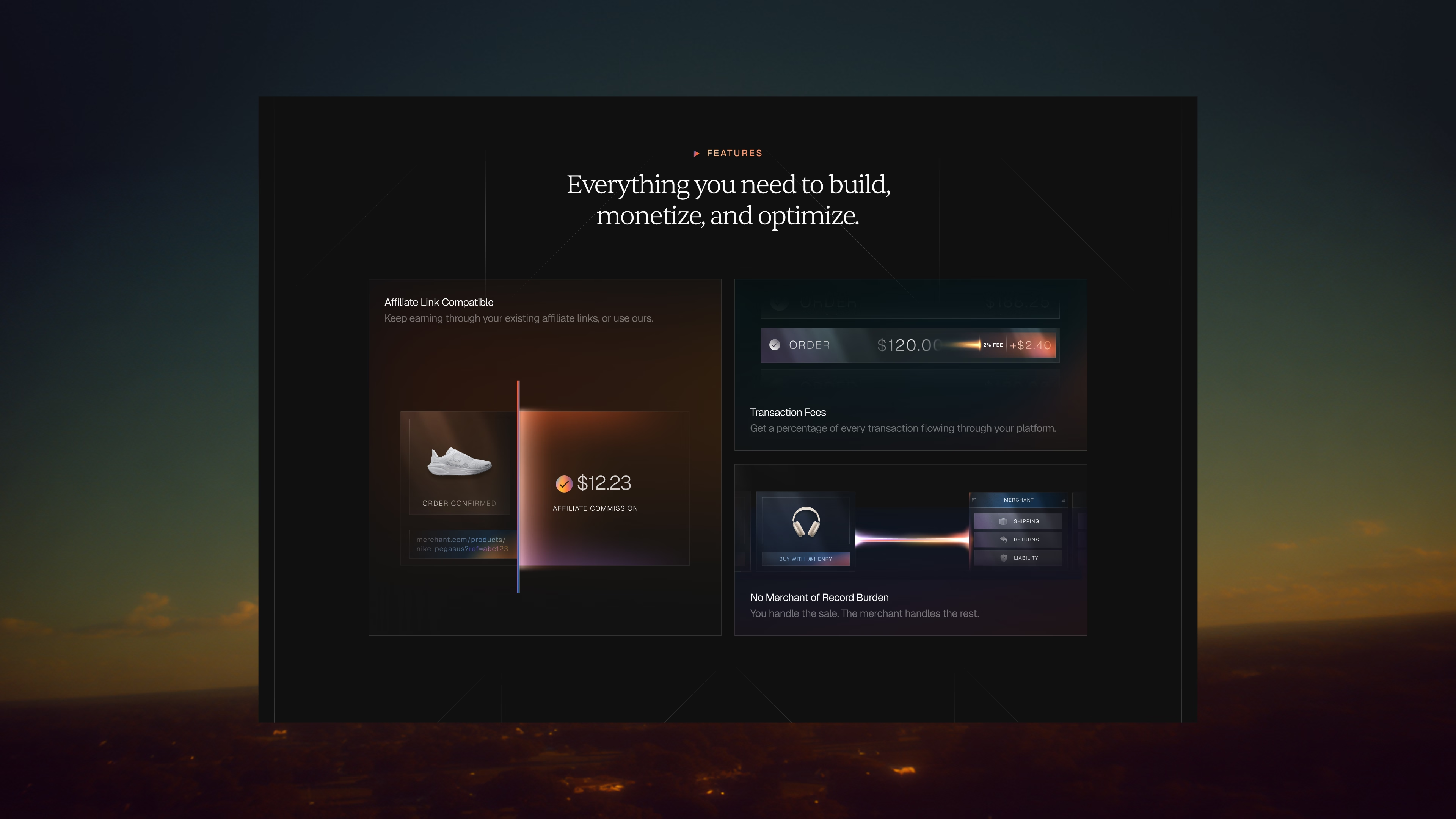
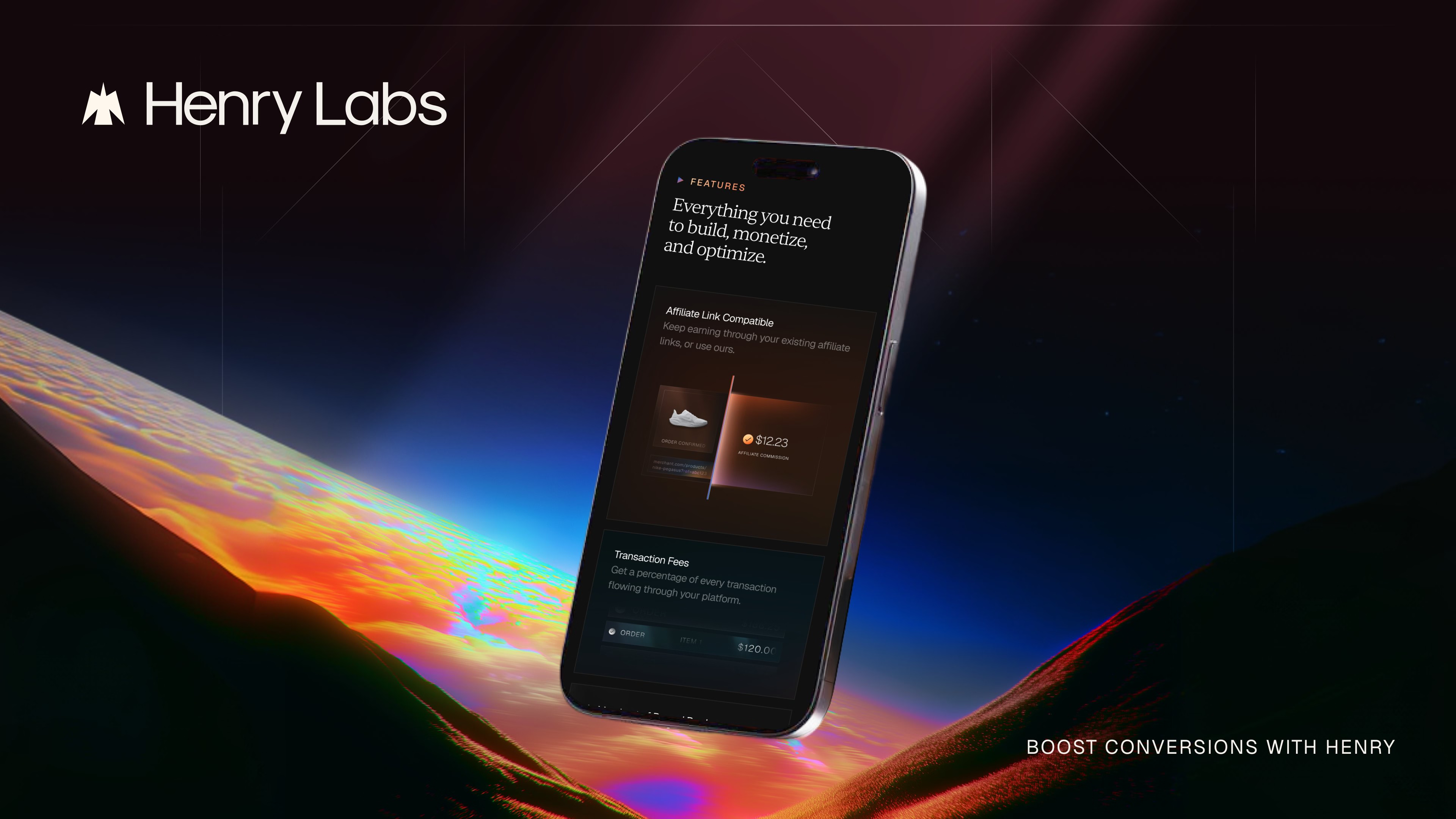
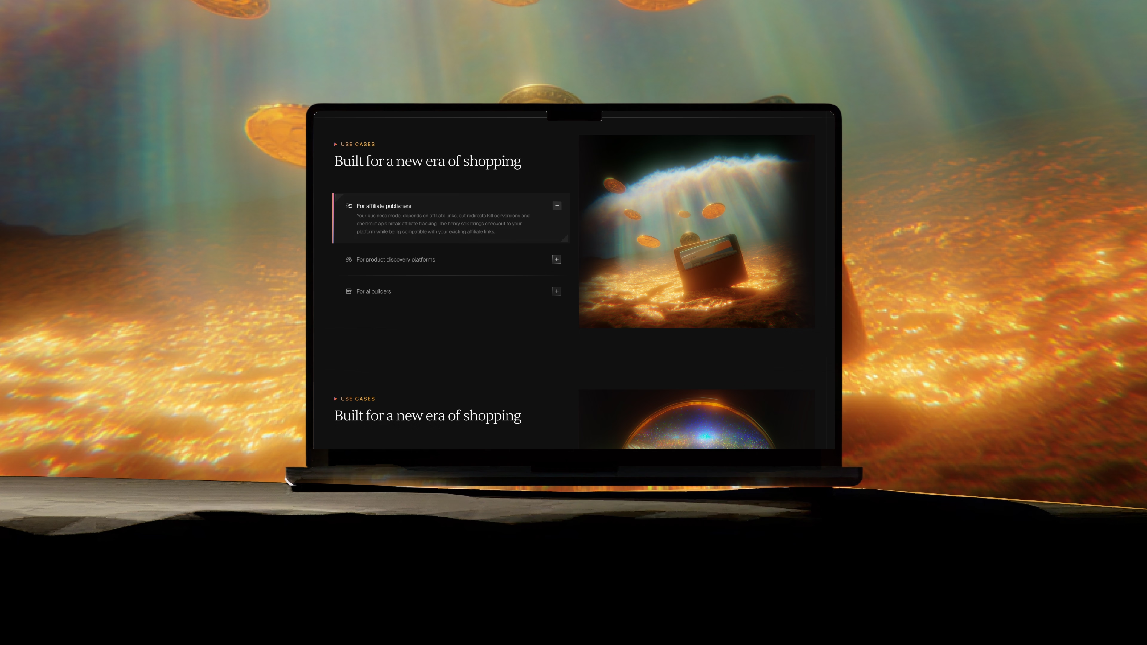
The website, partner dashboard and consumer checkout all run on the same design system, so a shopper at checkout and a partner checking revenue are looking at the same company. The website tells the story in the order a buyer needs it: product data, universal cart, embedded checkout, then the analytics that come after.
In their own words.
Client testimonial
“PIXELUP LABS has been a great partner for us at Henry Labs. They handled our landing page redesign and core product design, and the output speaks for itself. Fast, thoughtful, and easy to work with. Highly recommend!”

Faaris Hussain
COO, Henry Labs
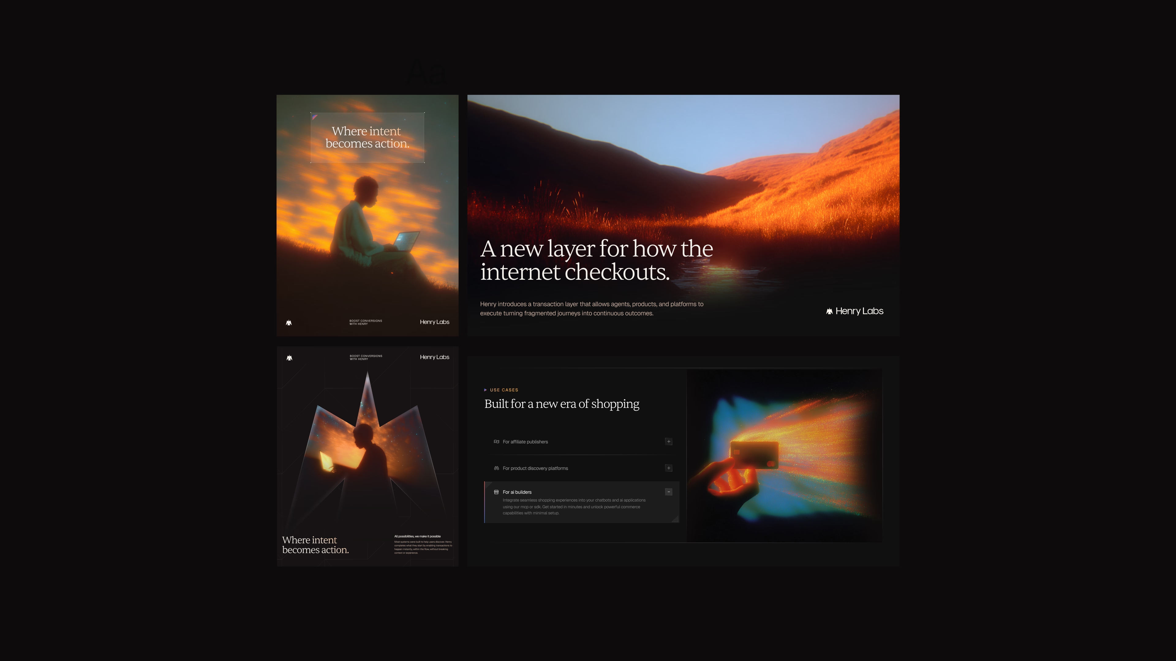
And this is where Henry Labs ended up.
Henry Labs now has a brand that looks as serious as the infrastructure behind it, a website that explains the product in the order buyers need it, and a design system its engineers build on directly.
The website went live in May 2026, and the checkout and dashboard were built in-house from our designs. Henry Labs CEO Phil Qiu shared it with one line: "We wanted a landing page that actually feels like that future rather than explaining it." By September, Henry Labs was powering Allowance (YC P26), which went from 9 to 90 stores in two weeks. You can see the live site at henrylabs.ai.
If you recognised Henry Labs' problem in your own company, we should talk. We work with AI and B2B SaaS teams on brand, web and product design, helping them look as credible as the product they have built.
Frequently asked questions
We build brands, websites and products for startups that need to command enterprise trust. Brand identity, website design, product design, design systems, motion and sales assets, all designed together as one system.
Greptile doubled demo requests in week one and raised a $25M Series A within six months of launch. Sully scaled 26x in 11 months after its redesign. Sainapse relaunched ahead of general availability and is now deployed by Fortune 500 companies including Ford and Freshworks.
We work on startup timelines. Most engagements ship in weeks, not months, and we regularly deliver under hard deadlines like fundraise announcements and launch dates.
Brand sprints are $15,000. Brand plus website projects run $25,000 to $40,000. Retainers start at $6,000 a month. See current services and pricing on Contra.
You work directly with the team on Slack, with fast turnarounds and quick iterations. No account managers, no layers, no surprises.
Rarely. Most clients come to us with something functional that no longer matches their ambition. We keep what works and rebuild what holds you back.
Book a discovery call or message us on Telegram. We will review where you are today and tell you honestly what we would change.